


Comparing Economies of All Countries on Earth in 2018
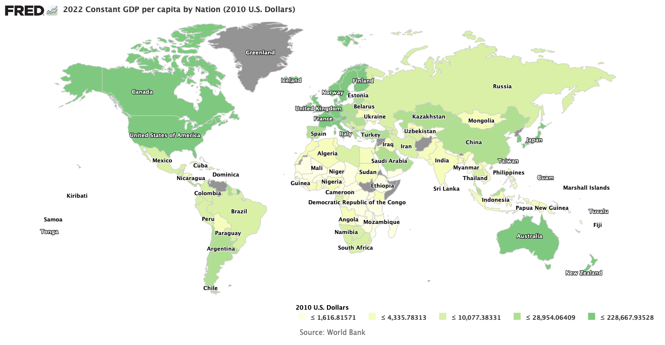
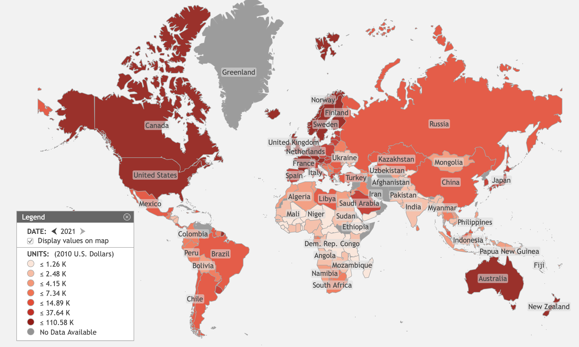
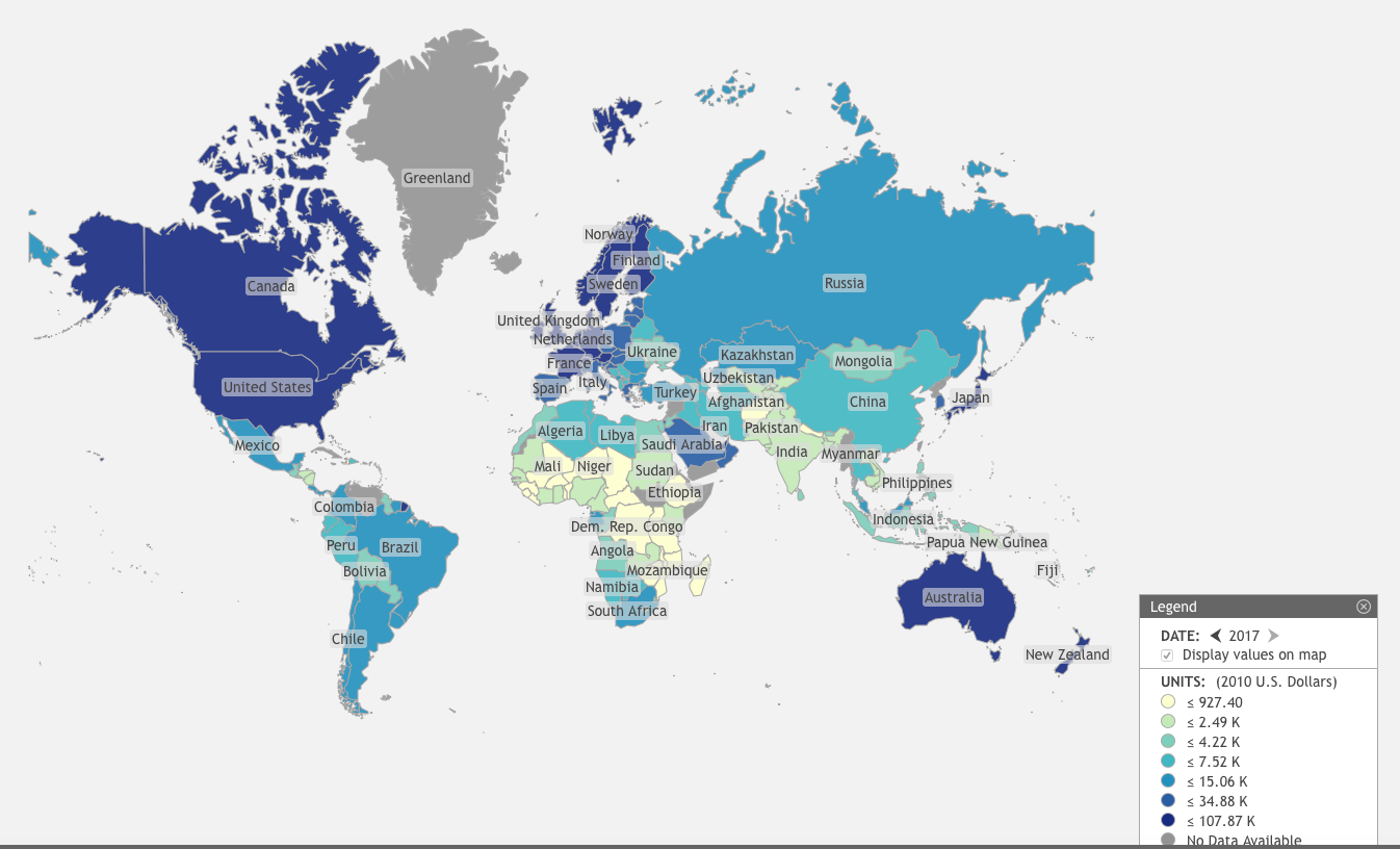
2017 GDP per capita by Nation in constant 2010 U.S. Dollars.
St. Louis Federal Reserve District Bank / GEOFRED
In June of 2016, I wrote a post comparing economies of all countries on Earth. Now that a couple of years have passed, it is time to go through that exercise again. This time, however, I hope to add a little more insight provided by two more years of experience.
The Purpose of the Exercise
The basic idea is to cut through all the claims and counterclaims about how economies work using real data. Almost all of the data used here was obtained through the World Bank, which in turn gathered most of it from the Organization for Economic Cooperation and Development (OECD). Some data came from the U.S. Federal Reserve’s Federal Reserve Economic Database (FRED). Some came from the Heritage Foundation’s Index of Economic Freedom.
Every country on Earth possesses an economy that is at least slightly and sometimes greatly different from every other country. Each one is a different experiment in economic organization. What can we learn from them about what makes economies run well?
The hottest argument between nations and between political parties within nations is the following. Just how much should governments interject themselves into the inner workings of their economies? Just how much should they attempt to direct and manage their economies?
The Available Evidence
To endeavor to answer these questions, we must have a measure of just how much each country’s government controls its economy. Luckily, we have the Index of Economic Freedom, calculated yearly for every country for which there is available data. It is calculated as a simple arithmetic average of 12 quantitative and qualitative factors. Each one measures a different way in which a government interacts with its country’s economy. They are grouped in four separate categories, which are shown in the list below, with their individual components listed below them.
- Rule of Law
- Property Rights
- Government Integrity
- Judicial Effectiveness
- Government Size
- Government Spending
- Tax Burden
- Fiscal Health
- Regulatory Efficiency
- Business Freedom
- Labor Freedom
- Monetary Freedom
- Open Markets
- Trade Freedom
- Investment Freedom
- Financial Freedom
The index varies in value from 0 to 100. If it is 0, then the government has the most tyrannical control over the economy conceivable. If it is 100, then government has absolutely no control over the economy and its markets. Click here to see the Heritage Foundation’s detailed methodology. Below is a Heritage Foundation video describing their program, and why it matters.
For the rest of this essay, I will refer to a country’s index of economic freedom as simply its “economic freedom.”
Now that we have a measure of a government’s influence on their economy, we need several figures of merit for how well that economy meets the needs of its society. There are several of interest, including GDP per capita, GDP growth rates, the Gini index, and the U.N.’s Human Development Index. In the section below, we will take a look at these figures of merit as a function of the countries’ economic freedom.
What the Countries of the World Have to Tell Us
Suppose we construct a scatter plot of each country’s GDP per capita versus their economic freedom. We place a point for every country where its x-coordinate is given by its economic freedom and its y-coordinate is its GDP per capita. If we were to do that using 2017 data, we would get the plot below. Click on the plot to get an expanded view.

Data Sources: Heritage Foundation and the World Bank
The blue squares denote developed countries with per capita GDPs above $35,000 in constant 2017 U.S. dollars, red crosses are undeveloped countries with per capita GDP below $15,000 constant 2017 dollars. The brown ‘x’s are all the intermediate countries in between. Quite clearly, large per capita GDPs are highly correlated with high values of economic freedom. There are absolutely no countries that can be described as developed with economic freedom below about 64.
How about GDP growth rates versus economic freedom? If we play the same game with those variables, we get the following scatter plot.

Data Source: the Heritage Foundation and the World Bank
What we expect to see from standard macroeconomic theory is that as an economy becomes more developed, its economic growth rate begins to slow. To the extent economic freedom is synonymous with economic development, we see that phenomenon here in this plot — up to a point. If you were to draw a trend line, with as many country points above the line as below it, from the lowest economic freedom to an economic freedom of about 75, the line’s slope would indeed be negative. However, surprisingly, a trend line for the countries above 75 would obviously be positive. What is going on? Is this a mirage created by a small data sample?
Suppose we were to do a 3D plot, with GDP growth rate plotted as a function of both economic freedom and per capita GDP. That would have the virtue of separating out the developed nations from the undeveloped and intermediate nations more cleanly. We then get the plot below.

Data Source: The Heritage Foundation and the World Bank.
At the low end of the economic development scale, you can see high economic growth rates fall as both economic freedom and GDP per capita increase. However, as GDP per capita gets larger than $60,000 and Economic freedom greater than 70, GDP growth rates begin to grow again. This fact can be better appreciated by looking at this same plot from a slightly different aspect angle.

Data Source: The Heritage Foundation and the World Bank
Here you can easily see that as economic freedom and GDP per capita increase, GDP growth falls among the undeveloped and intermediate countries. It then reaches a minimum, and inexplicably begins to increase again with developed nations having sufficiently high economic freedom. What can explain this unexpected result? A clue comes from a typical way in which economists model economic development and growth called the Solow-Swan model. I described this model in the posts The Solow-Swan Model and Where We We Are Economically (1), The Solow-Swan Model and Where We We Are Economically (2), and The Solow-Swan Model and Where We We Are Economically (3),
The heart of the Solow-Swan model is a description of how GDP (represented by the letter y) varies with the amount of total capital invested (k) and the total number of laborers employed (l). This is called a Cobb-Douglas production function, which is of the form

Invested capital and the number of laborers are generally called the primary factors of production. The factor A is called the total factor productivity. It is a function of all other secondary factors of production, such as technology, skill-level of labor, climate, etc. On division by the number of laborers, the Cobb-Douglas production function can be expressed as
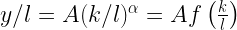
where fk/l) must be an increasing function of its argument. All the variables in this equation must be considered to be functions of time. Although this last expression gives the GDP per laborer, it can be considered as a stand-in for per capita GDP.
With developing nations the primary factors of production are readily available, and growth rates can be high. However, as time goes on available capital and labor supply are gradually absorbed. Total factor productivity and the exponent α might decrease due to increased government regulation and taxation. Demand for more production of existing goods might saturate, reducing incentives to invest more capital. There are any number of reasons to expect economic growth rates to fall with increasing economic development.
So why do we see increasing growth rates for highly developed countries with very high economic freedom? One big change must be that increasing economic freedom causes big increases in total factor productivity, A. If government regulation does not stultify corporate activity and if taxes do not greatly reduce available capital, companies can prosper. Incentives will exist for companies to invest in new products and services. Alternatively, companies might find more productive ways to turn out old products and services. Either of those outcomes will increase total factor productivity. In addition, reducing the drag of government regulations and taxes on companies might increase the exponent α. Apparently, this is exactly what happens as economic freedom increases.
Another extremely important figure of merit is the Gini index. It is usually scaled to vary from zero to 100. When it is zero, the GDP is evenly distributed among all citizens. When it is 100, only one person possesses the entire GDP and everyone else has nothing. While we might debate what the optimum value of the index might be, most people would want the Gini index to be low. Plotting the Gini index versus economic freedom produces the graph below. Unfortunately, the Gini index is seldom calculated for some countries. The latest values for countries’ Gini are used, although every point is a valid Gini index for a particular value of economic freedom. No Gini index over 10 years old is used.

Data Source: Heritage Foundation and the World Bank.
Clearly, the Gini index is trending downwards with increasing economic freedom. This is yet another reason to desire countries to have more economic freedom and less government control.
The final figure of merit to be examined is the U.N.’s Human Development Index (HDI). This index is a scaled geometric average of three sub-indices measuring educational attainments, life expectancy, and Gross National Income (GNI) per capita. The HDI varies from zero to one. Any country with an HDI of zero would be hell on Earth; and any country with an HDI of one, if not heaven on Earth, would at least be a very, very nice place to live. Unfortunately, the latest U.N. statistical update does not update the HDI from 2016.

For that reason, I will merely republish my original plot of HDI versus economic freedom.

Data Source: UN Development Programme / Heritage Foundation
As the index of economic freedom increases, so in general do countries’ HDIs. Since one would expect there are as many cultural determinants for a country’s HDI as economic, it is not at all surprising there is a great deal of scatter in the country points, especially at the lower values of the economic freedom index. What is a surprise is that as economic freedom increases and the HDIs approach their ideal value of one, the scatter progressively narrows. What this says is that whatever cultural variables influence HDI, they are so tightly coupled to economic freedom at high values of both indices that the index of economic freedom becomes a progressively better predictor of HDI.
Can Data Like This Save Us?
Today, Americans of different ideological persuasions increasingly hate each other, to put it mildly. This kind of hatred can not be mollified by everyone being civil. Nor can it be mitigated by attempting to put the interests of the country over partisan interests. Not to put too fine a point on the problem, but all sides of the ideological conflict are completely convinced their version of social reality is the accurate one. According to each side, the only hope for bettering our country is for their interpretation of social reality to prevail. If progressives see neoliberals (those folks who are usually called “conservative”) disagreeing with their view of social reality, it must be because neoliberals have severe character flaws.
Progressives started this game after the shock of Donald Trump defeating Hillary Clinton. After that, progressives started an ever-expanding set of accusations that neoliberals are fascist, xenophobic, racist, misogynist and all around very bad people.This is not a disagreement to be painted over by simply being civil. Instead, one side or the other must persuade their opponents of the errors of their ideological assumptions. If that is to be done, then we must seriously discuss data like that described above.
Views: 2,874