


U.S. Economy and Stock Markets, March 2018
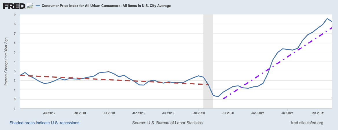
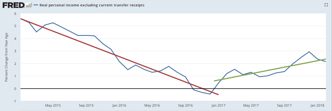
Percent change in personal income excluding current transfer payments. The red line is the linear trend over the last two years of Obama’s administration, while the green line is the trend from the start of the Trump administration.
Image Credit: St. Louis Federal Reserve District Bank / FRED
Having just updated my leading and coincident economic indicators, it is now time to attempt making sense of them. Where is our economy going, and why is it going there?
The Building Coherence of Economic Statistics, and the Tales They Tell
Since the last time I went through this exercise, the economic statistics have grown more coherent and self consistent. Among the 12 leading indicators I follow, one is bearish (pointing toward less growth), one neutral, and 10 bullish (pointing toward greater growth). Among my seven coincident indicators, none is bearish, one is neutral, and six are bullish.
This growing consistency is especially true about the St. Louis Federal Reserve’s Leading Index of the U.S,, which seemed to predict a worsening economy in November 2017 while most of the other indicators were at least hinting at a healthily growing economy. You can find the components making up the St. Louis Leading index on my Leading Economic Indicators page. Last November, the plot of the Leading Index versus time was as shown below.

Image Credit: St. Louis Federal Reserve / FRED
Now, however, with the data extended to December 2017, the plot looks much more encouraging.

Image Credit: St. Louis Federal Reserve District Bank / FRED
Other indicators that had looked encouraging have extended their positive run. Especially important among these are two related to investments by companies: Manufacturers’ new orders for non-defense capital goods and new orders for durable goods.

Image Credit: St. Louis Federal Reserve District Bank / FRED

Image Credit: St. Louis Federal Reserve District Bank / FRED
The take-off for the capital goods new orders began right around the election of Donald Trump, and that for durable goods new orders a few months before his election. The rising trends for both are continuing.
Other indicators continue to improve. One coincident indicator that many will find the most exciting is featured in the plot at the top of this post. I reproduce it again below as figure 5.

Image Credit: St. Louis Federal Reserve District Bank / FRED
Current transfer payments include things like income from social welfare. The growth of income plotted above includes only income for producing something in the economy. For almost two decades, middle class income has been falling. As you can see from figure 5, the policies of Barack Obama were not helping to stop that fall. Thankfully, starting with the beginning of the Trump regime, real personal income (i.e. income taking out inflation) is rising again. In February 2018 the annualized rate of growth was 2.1%.
The increase in the rate of growth of real personal income during Trump’s regime is for all income groups, so whether or not it helps the middle class will depend on how it is distributed. It will also depend on whether the rate of increase will continue to rise. Only time and future statistics on income distribution will tell the tale. However if unemployment decreases and the labor force participation rate increases, we can be hopeful the plight of the middle class might be reversed. The unemployment rate plotted below is the usual U3 unemployment rate. The labor force participation rate is the percent of the adult population that either has or is actively pursuing a job.

Image Credit: St. Louis Federal Reserve District Bank / FRED
Unemployment was gradually coming down in the last year of Obama, but its decrease quickened under Trump.

Image Credit: St. Louis Federal Reserve District Bank / FRED
Although the fall of the labor force participation rate bottomed in 2014 at around 63 percent, it has not changed appreciably since. If we can not find a way to motivate the economically discouraged to jump back into the labor force, our Social Security revenue problems will worsen and the channel of wealth transfer from companies to their employees will narrow.
The fact that economic demand is picking up can be seen in a number of statistics: Retail sales, the inventories-to-sales ratio, and in new building permits.

Image Credit: St. Louis Federal Reserve District Bank / FRED
This index increased sharply in the fourth quarter of 2016 and immediately after Donald Trump was elected president. Although there have been some large fluctuations in the growth rate of retail sales since then, the trend is definitely upwards.

Image Credit: St. Louis Federal Reserve District Bank / FRED
Inventories had been increasing faster than sales from the fourth quarter of 2014 through the first quarter of 2016. However, it has taken a steep decline from 1.58 in January 2016 to 1.28 in December of 2017. Although it remains above one and is fluctuating a fair amount, the trend line of the year-to-year per cent change has a negative slope. On average, inventories are decreasing with time. Its year-to-year change was -4.00% in January 2018. Sales are increasing fast enough that they are decreasing inventories, meaning factories will have to produce more to satisfy demand.

Image Credit: St. Louis Federal Reserve District Bank / FRED
Since August 2017 new building permits have been consistently increasing.
Increasing demand can also be seen in the new capital goods orders and the new durable goods orders of figures 3 and 4 above.
However the most important coincident indicator of all, the one I have been saving for last, is the Gross Domestic Product (GDP) growth rate.

Image Credit: St. Louis Federal Reserve District Bank / FRED
As one would expect from all the other statistics discussed above, GDP growth in the Trump era appears to be doing better than during the last three years of the Obama regime. In Q1 2017, the last quarter dominated by Obama’s policies, the growth rate was +1.2%, In the second and third quarters, this increased to 3.1% and 3.2% respectively. The second and penultimate estimate of the fourth quarter growth rate was 2.9%. This represents a hopeful start for the Trump administration.
Overall, the statistics show a consistently improving and growing economy, and a great improvement over the Obama years. What did President Trump and the Republicans do to produce this great turnaround?
How Trump’s Economic Policies Are Bettering the Economy (Or Not)
It is important to realize that the Tax Reduction and Jobs Act of December 2017 has not done hardly anything objective yet to produce the great improvements we see in the statistics. After only three months since its passage, there has not yet been enough time for it to objectively make a difference. However, as a prospective possibility last year, it has been enough to generate a certain amount of corporate enthusiasm for domestic investments.
Over the last year, however, most of the improvements have come from Donald Trump’s very partial deconstruction of the federal regulatory state. Unfortunately, this deconstruction has come almost entirely from presidential executive orders. This means it could all be easily countermanded by a future Democratic President by his or her executive orders. To make Trump’s changes of the regulatory state harder to change, they would have to be enshrined in federal law passed by Congress. But this is a story for a different post.
Mostly, Trump has hewn to neoliberal economic policy. I wish to be quite explicit about what I mean by “neoliberal”, as that word appears to have varying meanings depending on the audience. By neoliberal I mean a person who believes in classical liberalism and who also believes in the optimality of a capitalist free-market in supporting classically liberal values.
With that understood, Trump’s policies of limiting state regulation of the private economy, and of encouraging tax cuts, especially for companies, can only be described as neoliberal. These are the policies that have led to the economic good news heralded by the economic indicators discussed above. To understand how his policies have made such a difference, it helps to understand how the progressive policies of Obama made such a mess out of the economy.
It is actually not entirely the fault of the Obama administration, as the federal and state governments over decades have progressively made our once free-markets less free. As government regulations and taxes on companies have grown more onerous, those companies have found it much more difficult to earn profits and survive. This process also seems to have been similar in Europe, although they have taxed their companies a lot less and their citizens a lot more. One can see how our economic decay has long predated Obama by looking at ten-year moving averages of U.S. GDP growth rates plotted versus time. What the ten-year moving average does is to average over the business cycle fluctuations to reveal the long-term secular trends. Below is such a plot of U.S. GDP growth produced by a Gallup Organization economist, Jonathon Rothwell. You can download a PDF with a report of his research here.

The Gallup Organization
Although Obama did not originate the decay, the plot shows he certainly did accelerate it. The big drop centered on 2008-2009 was a product of the Great Recession, but that recession was caused by the progressive, dirigiste housing polices of Obama’s Democratic colleagues. To his credit, President George W. Bush tried to defuse the threat of the housing crisis, but Democrats blocked his proposals in Congress. This is evidenced by a video of a contemporary news report shown below.
Be that as it may, the continuing dirigiste policies of the Obama regime only deepened the malaise, as figure 12 shows no big recovery after the Great Recession.
As the United States began to have an increasingly impossible environment for corporate profits, many companies even began to leave the United States altogether. Acquiring some similar company in another country, the departing American corporation would adopt its identity in a process called corporate inversion. The Republic of Ireland, because of its free-market policies and low corporate taxes, was a favorite destination. A major test of Trump’s policies will be if he can halt the bleeding of U.S. companies to overseas.
With a complete reversal of economic policies from the progressive ones of Obama to the neoliberal policies of Trump, we are seeing the good results in the economic statistics. As the objective effects of the Tax Reduction and Jobs Act kick in, corporate domestic investment should skyrocket, corporate profits should increase, the wages of their employees should increase, and total retail sales should respond with an increase. Even before Trump, some American companies with overseas production facilities had decided to return those facilities to the United States. This was primarily because of increases in overseas wages and in transportation costs back to the U.S. However, with reduced production costs from deregulation and higher incentives for investments from lower taxes, this corporate return from overseas might well become a flood. Also, with the conversion of the U.S. tax system to a territorial tax system, multinational companies have every incentive to repatriate most of their $2 trillion plus assets in overseas accounts back to the United States, to be reinvested here. The good news we have seen from these economic indicators could be just the beginning.
However, we do have to worry about the Jekyll and Hyde character of President Donald Trump. Mostly over the last year we have seen his Dr. Jekyll neoliberal side. Nevertheless from time-to-time we also get peeks at his Mr, Hyde mercantilist side, and recently we seem to have been seeing a lot more of Mr. Hyde. If his suggestions of greatly increased import tariffs on countries with whom we have trade deficits are more than bargaining ploys, the resulting trade war could easily throw us into a severe recession. Let us hope these tariff threats are revealed very quickly as bargaining ploys. They have already wreaked havoc on the stock markets.
Our Crazy Stock Markets
American stock markets are having an exceedingly hard time deciding how they should allocate their capital. Volatile seems a very weak adjective to describe the fluctuations of the markets. This is shown in the recent candle plots of the indices for the Dow Jones Industrials and the Standard and Poor’s 500.

Image courtesy of StockCharts.com

Image Courtesy of StockCharts.com
At first the markets were getting nervous because of a more healthy economy possibly generating higher interest rates. [It does seem anomalous that the prospect of a more normal, healthy economy should have this kind of effect!] But then Trump announced his intention to impose tariffs on all imported steel and aluminum, and all hell broke loose to create the enormous market swings shown above.
Were it not for the threat of an international trade war, the stock markets would have very few objective reasons to worry. Already, Trump has walked back his tariff threats by carving out exclusions for Europe, Canada, Mexico, and a great many other countries with the one exception of China. More and more, his threats are beginning to look like a bargaining ruse. if this is the case, our immediate economic future looks very bright.
Views: 3,085
Excellent article, Charles. You should post this on Seeking Alpha and get paid for it.
I would very much like to, but there seems no easy way to submit the post to Seeking Alpha!