


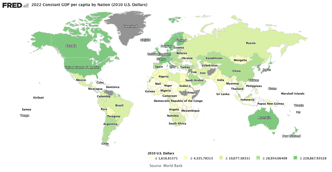


What is the Economy’s Condition?
Grizzly bears looking for a market to eat! Photo Credit: Flickr.com/wallyg
We all know the U.S. stock markets are beginning to enter “Bear” territory, but are their movements an omen for the economy? Below are today’s charts for the Dow Industrial 30 and the S&P 500.

Charts courtesy of StockCharts.com
Note that both indices are below their 50 day (blue curve) and 200 day (red curve) moving averages. But does this have much to do with the state of the economy? After all, the stock markets are generally over-priced, as one can see from the Shiller Cyclicly Averaged PE Ratio (CAPE). The long-term average of the CAPE is about 17, while currently it is approximately 25, even with all the market drops to date! Perhaps all we are witnessing is the bursting of the stock market bubble inflated by the Federal Reserve.
So what do other economic indices tell us? First, let us ask how sales of goods have been changing lately. Below, compare the curve for total retail sales in blue with the curve for manufacturers’ total inventories in green.

Both quantities have been relatively constant over the last couple of years, with manufacturers’ total inventories considerably larger (about $250 billion more) than total retail sales, with a ratio of about 1.6. Although the total business inventories to sales ratio showed a sharp spike in January and February of this year, the ratio has since declined to somewhat smaller values around 1.34. Total sales currently seems to be a “ho-hum” kind of factor, neither falling alarmingly nor rising in a way helpful for growth.
Next, let us consider how much the economy is producing in the way of goods. Some relevant aggregate variables for production are shown in the next graph below.

The values of manufacturers’ new orders for durable goods, manufacturers’ new orders for non-defense capital goods excluding aircraft, and the value of manufacturers’ new orders for consumer goods industries are all “ho-hum” variables hardly changing the status quo one way or the other. A little more interesting are the changes in the Industrial Production Index, which measures the output from manufacturing, mining, electric, and gas industries. In this graph the index expresses output as a ratio with the output from the year 2012 times 100. As production recovered from the depths of the Great Recession, the index rose from about 103 in January 2014 to 107.9 in December, 2014, an increase of 4.7%. The trend line since that time is slightly down. Not quite “ho-hum”, but it almost is.
Aggregate variables that are anything but boring are the amounts of debt being carried both by the federal government and by American households. These are shown in the next graph below. High debt carried by the government and households both burden the economy, albeit in different ways.

The graph shows household debt falling from a ridiculously high 95% of GDP from the depths of the Great Recession to a still ridiculously high 80% of GDP in the first quarter of 2015. Even worse, the blue curve of household debt shows every evidence of having reached a minimum with a real possibility of rising yet once more. Households struggling under a mountain of debt will have to spend a lot to service their debts, leaving less for expenditures on goods and services that would increase the GDP.
Government debt on the other hand increased from a huge value of about 87% of GDP in the first quarter of 2010 to a mind-blowing 103% of GDP currently. Luckily, this growth has temporarily been stopped by sequestration starting January 2, 2013 and continuing to 2021. Sometime in the early 2020s growth in government debt should again explode with spending on the entitlements. The Heritage Foundation projects entitlement spending at 34% of GDP by 2035. Why is all this alarming? Research by Carmen Reinhart and Kenneth Rogoff has shown that sovereign debt somewhat greater than 90% of GDP would cause governments to begin crowding corporations out of capital markets to service their debts, thereby causing smaller investments and less GDP growth.
Another fruitful inquiry is suggested by the household debt problem. If debt is a real problem then a way of getting out of debt by finding a job and earning a higher income is certainly of importance. In the chart below you will find the civilian labor force participation rate (blue curve) and the median real weekly earnings of full-time employees (red curve).

As you may have heard from news reports, the fraction of the adult population that is participating in the labor market, the labor force participation rate, has been steadily falling since the great recession. From the chart you can see the median real weekly earnings for full-time employees fell along with the labor participation rate until January 2013, stayed constant throughout 2013 and has been slightly increasing since. Clearly the loss of jobs during the great recession and the economy’s lessened need for labor for a few years caused a fall in median income as labor supply exceeded its demand. At the same time the slackened demand for labor caused many unemployed to become long-term unemployed, and finally discouraged enough to leave the labor market altogether. There is no telling from the data so far whether or not the labor participation rate will continue to fall. Similarly, we can not yet know if the median income will continue to rise, or whether economic troubles will cause the median income to turn down again. Either way, there is little hope for economic growth in the short-term from additional income to households.
Early last August I published a post that highlighted how commodity prices were almost all collapsing. To illustrate this point I am re-posting the chart giving the year-over-year changes in commodity prices below.

The point is made even stronger by plotting both the commodity producer price index and the West Texas intermediate crude oil prices versus time, as shown below.

Note how strongly the commodity PPI and the crude oil prices are correlated. Since there is more to the commodity PPI than the single commodity of oil, there must be some coupled set of phenomena causing the fall of all commodity prices. Many have pointed to a fall in demand from a weakened China as the coupling link. However, a fall in commodity demand might also characterize many other weakened economies, including that of the U.S.
Finally let us consider the factor of foreign trade. If the entire global economy is weakening, we would expect both exports and imports to suffer as well. To test this thought, consider the chart below giving both export and import indices that compare export and import volumes to their volumes in the year 2010.

As one would expect, they are tightly correlated and usually approximately equal. However, the major point of interest now is that they have been dropping precipitously since the middle of 2014 by about 3%. According to the Bureau of Economic Analysis, U.S. exports in the second quarter of 2015 were $385 billion and the imports were $573 billion. Annualized and then divided by a GDP of $17.4 trillion, we get annualized exports of 8.9% of U.S. GDP and annualized imports of 13.2% of GDP, so a fall of 3% in both imports and exports is a very big deal indeed. To the extent the U.S. is tied to the world economy, these are ominous portents.
There are many interested parties, from investment fund managers to stock brokers to Obama administration officials, who would like to convince us that the economy is healthy and growing. However, just this cursory look at economic statistics provided by the U.S. Federal Reserve Economic Database (FRED) convinces me they are just whistling past the graveyard.
Views: 2,391