


U.S. Economy and Stock Markets, October 2016
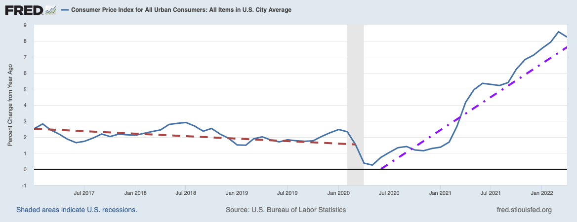
The time-evolution of the GDPNow statistic from the Center for Quantitative Economic Research of the Federal Reserve Bank of Atlanta.
Image Credit: Federal Reserve District Bank of Atlanta/Center for Quantitative Economic Research
The graph above of the GDPNow statistic produced by the Atlanta Federal Reserve confirms what the bulk of economic statistics are saying to me. By now it should be obvious to even the most dense that something is very, very wrong with our economy.
The Bad News from Economic Statistics
GDPNow is the on-going best guess by the Atlanta Fed’s economists of what the current quarter’s growth will be. Naturally it will evolve in time from the beginning of the quarter to its end, hopefully constantly getting closer to the actual value at quarter’s end. In recent quarters it seems to have always started out high, only to constantly decay to smaller values by quarter’s end. This is the case with the current third quarter of 2016. At the present time it is predicting a third quarter annualized GDP grow rate of 2.1 percent, down from an initial 3.6 percent and maxing out early at around 3.75 percent, only to fall precipitously to the present 2.1 percent. Given the steepness of its recent fall, this quarter’s annualized GDP growth could easily fall below 2.0 percent before all is said and done.
This prediction is completely consistent with the story being told by the economic statistics I have been checking out. As I usually do when I review the U.S. economy’s current health and performance, I have updated my pages for my leading and coincident economic indicators. Among the twelve leading indicators I follow, eight are bearish, three neutral, and one bullish, for a net score of -7 bearish. Of my six coincident indicators, three are bearish, two neutral, and one bullish for a net score of -2 bearish. Especially with the leading indicators, this represents a big shift toward a prediction of imminent recession. The last time I looked at these indictors on August 15, the leading indicators had a net score of -4 bearish, while the coincident indicators had a net score of -1 bearish.
The indicators predicting an imminent recession have grown more numerous and less ambiguous. Of these, one of the most important is the historical development of GDP growth itself over the past two years, illustrated below.

Image Credit: St. Louis Federal Reserve District Bank/FRED
This plot makes quite clear with the red linear fit that the real GDP trend over the past two years has been steadily downward. The next most important piece of evidence is a creation by Federal Reserve economists, the Labor Market Conditions Index (LMCI), or more specifically, the monthly change in the LMCI, which is probably one of the most perfect coincident indicators ever invented.

Image Credit: St. Louis Federal Reserve District Bank/FRED
The plot above tells us that over the same two years GDP was trending downwards, so was the monthly change in the LMCI.
But you say you thought the unemployment problem was getting better? The unemployment statistics that say that appear to be something of a chimera. As I discussed in Labor Market Not Nearly As Good As Many Think, the economic optimists have been excited about the prospect of the long decline of the labor market participation rate bottoming out. Ever since the economy began recovering from the Great Recession, pessimists such as myself have been pointing out that a large part of the explanation for improvement in unemployment statistics was due to people leaving the work force.
With a smaller workforce size in the denominator of an employment rate calculation, the employment rate, the number employed divided by the workforce size, becomes magically larger. Then, because the total workforce is the employed plus the unemployed (but looking for work), the unemployment rate is one minus the employment rate, and it becomes smaller as the employment rate becomes larger. (This is if we take the employment and unemployment rates as fractions of the total workforce. To get the same numbers as percentages, multiply by 100.) In symbols, if we define E as the number of employed workers, U as the number of unemployed, and W as the size of the workforce, then
W = E + U, 1 = E/W + U/W = Re + Ru where Re and Ru are the employment and unemployment rates respectively.
Let us say that the number in the workforce decreases by an amount Δ, and the reason why it decreases is because people left the ranks of the unemployed, either because they retired, died, or because they became discouraged and just gave up. Then the number of employed remains the same, but the number of unemployed decreases to
U’ = U – Δ and W’ = W – Δ = E + (U – Δ). This gives the new employment and unemployment rates as
R’e = E/W’ , R’u = U’/W’ = (U – Δ)/(W – Δ).
However, if Δ is a small fraction of the workforce (let us certainly hope for that, even in the depths of depression!), then
R’u = (U – Δ)/(W – Δ) ≈ (U – Δ)/W < Ru. The new unemployment rate is then smaller than the old one, and because E remains the same while the workforce has become smaller, the new employment rate R’e is larger. At the same the labor market participation rate defined as the size of the workforce divided by the number of people in the adult population would get smaller as the workforce decreases.
What the economic optimists have been trying to argue is that as people leave the workforce, and both the unemployment rate and the labor market participation rate become smaller, the reason for all this is mostly because older Americans are leaving the workforce by retiring. It is not, the optimists say, because unemployed workers become discouraged and just give up. However any number of sources show how this is not the case. Consider, for example, the post U.S. Unemployment: Retirees Are Not The Labor Exodus Problem by Robert Romano on the Forbes.com website. In it he points out first the labor market participation rate has been declining since 1997 when it peaked at 67.1 percent, and that retirement by the “baby-boomers” did not start in earnest until 2010.
Meaning, retirement cannot be thought to have played much of a role in the participation rates up until that point, and may only be tangentially affecting it now.
On the other side are those such as senior fellow and director of Economics21 at the Manhattan Institute, Diana Furchtgott-Roth who, in a Jan. 14 piece for RealcCearMarkets.com noted that “since 2000 the labor force participation rates of workers 55 and over have been rising steadily, and the labor force participation rates of workers between 16 and 54 have been declining.”
So many of those who would be expected to retire are hanging onto their jobs, while many of those who would be expected to stay in the workforce are dropping out. Commenting on Furchtgott-Roth’s claim, Romano wrote:
Which is absolutely true. Since 2003, those 65 years and older have seen their labor force participation rate rise from 13.99 percent to 18.7 percent. Those aged 55-64 saw their rate rise from 62.44 percent to 64.36 percent, a recent Americans for Limited Government (ALG) study of Bureau data from 2003-2013 shows.
Meanwhile, participation by those aged 16-24 dropped from 61.56 percent in 2003 to 55.05 percent in 2013, and for those aged 25-54, it dropped from 82.98 percent to 82.01 percent.
Since the economic optimists can not explain away the drop in the labor market participation rate as being due to anything other than discouraged people leaving the workforce, some of them were quite excited to see what they thought was a bottoming out of its long decline.The evidence for such a bottoming out can be seen in the graph below.

Image Credit: St. Louis Federal Reserve District Bank/FRED
Since the beginning of 2016 you can see a definite uptick in the participation rate. However, Chris Matthews in a Fortune Magazine post demonstrated that this uptick is due to temporary factors, and we should soon expect a reversion to the trend. In particular, Matthews took notice that the flows of people out of the labor force (discouraged workers or retirees) and flows into the work force (newly looking or new hires) are both still trending downwards. As evidence, he displayed the plot below from Haver Analytics.

Image Credit: Chris Matthews, Fortune/Haver Analytics, Renaissance Macro Research
The flows into and out of the labor force are given by the black and gray curves, respectively, while the labor force participation rate is superimposed in orange. Note the June peak in the participation rate is explained by a momentary upward move of the flows into the labor market and a larger than recent trend move downwards of the flows out of the labor force. After June both flows resumed their original trends downward. The flow of labor out of the market is still less than the flow into the market, so the labor force participation rate will still increase, albeit at a much slower rate. However, the two curves appear to be converging, and should the black curve dip below the gray, the labor force participation rate will resume its decline.
What this demonstrates is that to the extent the participation rate increases, it is not because of more people entering the workforce, but because they are leaving it at a slower rate than other people are entering it, which itself is a falling rate. From the other statistics in my leading and coincident indicators, we have every reason to believe the flows both into and out of the labor force will continue to decline, and that flows into the labor force will soon be less than flows out of it.
Batten down the hatches! Economic storm ahead!
Distortions Created by the Federal Reserve and the Response of the Stock Markets
The U.S. Federal Reserve should heed the lesson given by an increasing money supply in the presence of declining money velocity, a low inflation rate, and low GDP growth. Consider the two plots below.

Image Credit: St. Louis Federal Reserve District Bank/FRED

Image Credit: St. Louis Federal Reserve/FRED
How can the amount of money in the system increase, while its velocity decreases in the presence of very low inflation and low economic growth? (What is meant by the velocity of money is the average number of times a dollar will change hands in purchases in a year.) If inflation does not increase with a large increase in money coincident with low economic growth, then most of that new money is not doing anything but sitting uselessly in bank vaults (or more likely in bank computers) somewhere. The Fed creates new money for the member commercial banks, which promptly allow the money to stagnate, probably in excess reserves with the Federal Reserve.
What the Fed wanted that money to do was to be lent by banks to companies to stimulate their economic activity. However, companies have been refusing to borrow for the purpose of increasing production. To the extent they have been borrowing, they have using that borrowed money mostly to buy back their own stock, thereby increasing the value of the shares remaining in circulation and increasing the earnings per outstanding share. As Reuters has reported in a November 2015 post,
Almost 60 percent of the 3,297 publicly traded non-financial U.S. companies Reuters examined have bought back their shares since 2010. In fiscal 2014, spending on buybacks and dividends surpassed the companies’ combined net income for the first time outside of a recessionary period, and continued to climb for the 613 companies that have already reported for fiscal 2015.
The only obvious result of the Fed holding interest rates down has been borrowing by companies and stock traders to buy stocks, and as a result inflating their prices relative to the earnings per share, i.e. relative to their economic value. Consider the chart below of the S&P 500 index over the past three years.

Image courtesy of StockCharts.com
The index during that period has increased from about 1700 in October 2013 to around 2150 in October, 2016, an increase of approximately 26.5 percent. During that same period, real GDP increased from $15.79 trillion chained 2009 dollars to $16.58 trillion, an increase of about 5.0 percent. Stock prices in the S&P 500 increased more than five times faster than the GDP over that three year period. That is quite a price inflation!
To make matters even worse, not only have the stock prices inflated, but at the same time the earnings per share have fallen. We are about to enter earnings season for Q3 of 2016, when publicly traded companies generally release their quarterly earnings reports. At that time the earnings recession (a period of falling earnings) for S&P 500 companies is expected to lengthen to a sixth straight quarter. How much longer can stock prices increase while the earnings per share of companies are declining? At some point even companies buying back their own stock will have to believe their stocks are far too pricey to buy back. Generally, you want to buy a stock when its price has a fairly low value relative to its earnings per share. The very best price to earnings ratio, using earnings adjusted for inflation and averaged over the past 10 years, is the Shiller Cyclically Averaged Price to Earnings Ratio, or CAPE. Right now the Shiller Cape for the S&P 500 is 26.7, which is 59.9 percent higher than its historical mean of 16.7.
So if the Federal Reserve is only successful in inflating a stock market bubble with their low interest rate policies, why should they continue such a damaging monetary policy? They are certainly not stimulating actual economic growth in any meaningful way and are doing actual damage to the banking system. Banks earn money primarily by the interest paid them on loans. If real interest rates (the nominal interest minus the inflation rate) are held close to zero, it is very, very hard for a commercial bank to earn money and stay alive. Low interest rates also damage national savings, which are the source of all investments. Since the Fed is not stimulating the economy by holding interest rates low, they might as well increase them to eliminate the economic damage done by low rates. After all, the real reason why companies are not investing has to do more with federal government economic regulations and high taxes, not the availability of cash.
Views: 1,918