What Makes A Nation’s GDP Distribution More Unequal?
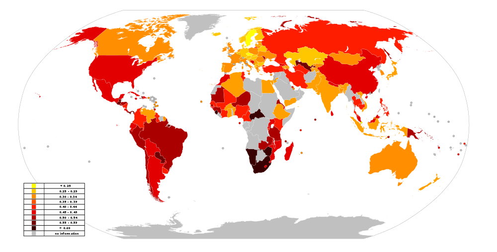
World Map of the GINI Index, published on Wikipedia.com in 2014. The darker a nation’s color, the larger its GINI index and therefore the more unequal its income distribution of GDP. The map is based on data published by the CIA.
Wikimedia Commons / Kurzon
One of the most common criticisms of free-market capitalism by progressives is that capitalism is increasing the inequality of income distribution of the nation’s GDP. This is the thesis of the French socialist economist, Thomas Piketty, which has found a great deal of support among many progressives. As it turns out, Piketty’s thesis is a recapitulation of Malthus’ and Ricardo’s Iron Law of Wages, and it is wrong for the same basic reason that the classical Iron Law of Wages was wrong. Skilled human labor is a scarce economic commodity. Its prices (wages and salaries) are bid up by corporations in competition with each other to grab their share of available skilled labor. Over the past two centuries or so that has been enough to increase the standard of living for everyone in free-market economies. If middle class wages have stagnated over the past two decades, and the share of GDP taken by the very rich has increased, this is the fault of government policies suppressing companies’ ability to make profits. This takes away companies’ motivation to invest and hire more. Not requiring increasing amounts of skilled labor, companies allow wages to stagnate and the GDP distribution becomes more unequal.
At any rate, that is the neoliberal view opposing that of the progressives. If it is true, we should be able to find evidence for it in economic data from that vast world laboratory in which each country is a different experiment.
The GINI Index and Its Relation to GDP Distribution
The GINI index is the almost universally used statistic to measure the equality of a nation’s income distribution. It is defined in terms of the Lorenz curve for a country as displayed below.

Image Credit: Wikimedia Commons / Reidpath
The x-coordinate on the horizontal x-axis represents the x% of households with the lowest incomes. To get the vertical y-axis coordinate on the Lorenz curve, we add together the accumulated income of the lowest x%. The fully constructed Lorenz curve then separates regions A and B in the figure. Let A be the area of region A and B be the area of region B. If there is absolutely no inequality, then the x percent of the households with the lowest incomes have x percent of the income, and the Lorenz curve becomes the Line of Equality in the figure. As a country’s economy becomes increasingly equal, the Lorenz curve approaches the Line of Equality ever closer, until finally at complete equality A=0 and B is the entire area under the Line of Equality. When there is complete inequality only one household has 100% of the income and all the rest have 0%. In that case the Lorenz curve is on the x-axis until it reaches 100% of the population, where it jumps vertically to hit 100% of the income. Then A is the entire area under the Line of Equality and B=0. The Gini index G can then be defined as
As defined, the GINI index varies from zero to one, but it is almost universally multiplied by 100 to scale it to vary from zero to 100. The smaller the GINI index, the closer the Lorenz curve approaches the Line of Equality and the more equally the GDP is distributed among the population.
Recent Data on The GINI Index and Its Variation with The Index of Economic Freedom
At the very top of this post is a color-coded world map of the GINI index as of 2014, with the data source being the Central Intelligence Agency. If you go down the list of countries in the CIA documentation, you will find along with the country’s GINI index the year in which the index was calculated. Most of the values posted were calculated before 2014, sometimes more than a decade prior. For this reason I use the data published by the World Bank, which provides much more recent data. For many countries, especially for Europe, annual data is available, albeit possibly several years old. Unfortunately, for some countries like the United States the data points can be three, four, or even five years apart. In what follows, I by necessity use the most recent GINI index value available.
In addition, because the 2017 Index of Economic Freedom (IEF) was calculated with data from the last half of 2015 and the first half of 2016, I will use the 2017 IEF and its factors together with the 2016 GINI values (or those closest to 2016) in the analysis below. The IEF is a rough measure of how much a government controls its economy. An IEF of zero indicates an economy with absolutely no individual economic freedom, totally dominated by the state; and a value of 100 denotes an economy completely unaffected by the state.
In previous posts I have shown plots of all countries’ GINI indices versus their IEF in scatterplots to show their GINI values decreased with their IEF on average. In this essay I will explicitly show the differences between developing and developed economies in this kind of analysis. In developing economies all the country has to do to increase its GDP is to increase capital and labor invested in already existing products and services. In a developed economy this is usually no longer the case. Instead a developed economy must create new products and services or find ways to increase productivity in producing old products and services. As a dividing line, I have somewhat arbitrarily designated economies with GDP per capita less than $20,000 in 2016 dollars as developing, and those with GDP per capita greater than $20,000 as developed. Although this arbitrary border may introduce inaccuracies, it will also reveal important distinctions.
Consider first the GINI indices of developed countries as plotted in the scatterplot below versus their Indices of Economic Freedom.

Data Sources: World Bank and Heritage Foundation.
If you focus to the left of the “Average IEF” vertical line, you can probably persuade yourself the accumulated distance of points above the horizontal “Average GINI” line is greater than that that of the single point below the horizontal line. Similarly, to the right of the “Average IEF” line, the accumulated distance of points below the “Average GINI” line is greater than the summed distance of points above the line. This indicates countries’ GINI values are generally decreasing with increasing IEF. The same assertion is true for the developing nations, if not quite so obvious visually as shown below.

Data Sources: World Bank and Heritage Foundation.
The total picture becomes more obvious when you add the two populations together.

Data Sources: World Bank and Heritage Foundation
The two populations together make it absolutely clear that on average as economies become more like free-markets, their GINI indices become smaller indicating a more equitable distribution of their GDPs. Note that in general developing countries have lower values of IEF and higher values of the GINI index than do the developed countries.
Of course, there is a large amount of scatter of the country points about the trend line in the plot above. The IEF itself is an unweighted, arithmetic average of 12 components, each one measuring a different way in which the state aids or impedes the free-market. Each of the 12 components varies from zero to 100, with zero indicating no economic freedom and an economy dominated by government. A component value of 100 usually indicates no government interference in that aspect of the economy, but occasionally (e.g. with the component Judicial Effectiveness) it shows maximal government support for free-markets. In a way, you can think of the Index of Economic Freedom for a given country as the length of a 12-dimensional state vector. The scatter of country points about the red trend line above can then be explained as the GINI results for countries with similar length vectors but different directions for their state vectors. The direction of the vector can be as important as its length for GINI.
An Important Tool for Determining What Affects the GINI Index Most
To discover which ways of government economic interference are most important in determining the country’s GINI index, we need a more quantitative measure of the correlation between each of the IEF components and the GINI index. The rest of this section requires some low-level mathematics, so if you feel uncomfortable with that, you can immediately go to the next section. The only thing you need know is that for any two variables, x and y, associated with each other in some way in a statistical population, there is a correlation coefficient, ρxy , that can take on values between -1 and +1. For example, the two variables can be two properties of a single nation in a statistical population of such nations, like the country’s IEF and its GINI index. If the correlation coefficient is -1, absolutely every time one variable goes up, the other goes down. If ρxy is +1, absolutely every time one variable goes up, the other goes up also. However, if ρxy is close to zero, there is little or no correlation between the two variables.
To construct such a measure for a population of statistical variables, we need three kinds of statistical constructs. For any variable x we need to calculate its unweighted average, μx, and its mean square deviation from its average, σx2 . We also need similar quantities from another statistical variable y: μy and σy2 . The definition for the average is the familiar one we all learned in grade school.
[In case you are not familiar with summation notation, its use above is defined by
Different lower and upper limits can be chosen for the summation index k.] For example, x can be the Index of Economic Freedom with xk being the IEF for nation k. Similarly, the mean square deviation for variable x is defined by
The square root of this quantity is also called the variable’s standard deviation. For the third needed statistical construct, we define the covariance between variables x and y by
If the covariance is negative, then for most values of xk and yk, xk is above μx when yk is below μy, or vice versa. This means when x increases, y tends to decrease, or vice versa. Contrariwise, if the covariance is positive and one variable increases (decreases), the other variable will tend to increase (decrease) also. Normalizing the covariance with the product σx·σy gives us the correlation coefficient ρxy , which must vary between -1 and +1.
If ρxy approaches either +1 or -1, then the two variables x and y are strongly positively or negatively correlated, respectively. If their correlation coefficient is close to zero, then their correlation is weak or nonexistent.
The correlation coefficient is the tool we need to determine which variables in a population of nations are strongly correlated and in what way.
Correlations between the GINI Index and the Index of Economic Freedom and Its Component Factors for Developed Nations
Let us first take a look at the correlation between the GINI indices of developed nations and their IEFs or their component factors. That is, for x in the equations above, we take the developed nations’ IEFs or the component factors of their IEFs. We use the nations’ GINI indices for y, and the summations are over the developed nations of the world. When we do this, we find the average and standard deviation of the GINI index in the developed country population to be
GINI average μy = 32.2762, Standard deviation σy = 3.6864.
You should definitely take note that the variation of the GINI index in the developed nation population — with a standard deviation from average of 3.6864 when the possible values can vary from 0 to 100 — is very, very small. No matter how we slice and dice the data, all GINI values will lie within a very narrow band when any of the IEF factors is varied.
When we calculate the correlation coefficient of these nations’ GINI indices with their IEFs and their factor scores, we find the following table of data. The names of the factors are highly suggestive of the meaning for their scores, but to see their exact meaning and how they are calculated, consult the Heritage Foundation’s Index of Economic Freedom Methodology page. Also, I should give you the following words of warning. A factor score goes up in most cases where government control of that aspect of the economy goes down; or as in the case of Judicial Effectiveness and Government Integrity, where the government actively supports and reinforces free-markets and capitalism. For example, if one country’s scores in Government Spending and Tax Burden are higher than another’s, it is because that government’s spending and taxes are lower, not higher.
| IEF Factor | Average | Standard Deviation | Correlation Coefficient with GINI Index |
|---|---|---|---|
| Index of Economic Freedom | 71.1619 | 5.7684 | -0.329541 |
| Property Rights | 83.2286 | 6.1087 | -0.538815 |
| Business Freedom | 80.2619 | 8.4475 | -0.521535 |
| Fiscal Health | 71.3000 | 21.7681 | -0.469380 |
| Government Integrity | 72.4905 | 13.3133 | -0.449942 |
| Financial Freedom | 70.0000 | 10.6904 | -0.363706 |
| Judicial Effectiveness | 72.1143 | 10.6996 | -0.324862 |
| Monetary Freedom | 84.1667 | 2.7183 | -0.247619 |
| Investment Freedom | 83.5714 | 6.5725 | -0.207771 |
| Trade Freedom | 86.7524 | 1.6792 | -0.094035 |
| Labor Freedom | 60.1143 | 13.3204 | 0.031379 |
| Tax Burden | 58.3667 | 10.1914 | 0.262731 |
| Government Spending | 31.5667 | 19.4225 | 0.390764 |
The first observation you should make is the GINI correlation coefficient with the IEF itself, as well as with almost all of its component factors, is negative. A negative correlation coefficient means as the IEF factor is increasing (the economy is becoming more like a free-market), the GINI index is decreasing on average. That is, the countries’ GDPs are becoming more equitably distributed on average as their economies become more like free-markets. Secondly, the correlation coefficients with the Trade Freedom and Labor Freedom factors are so small they should be considered statistically insignificant compared to the others.
The six most important factors for ensuring equitable GDP distribution among developed nations, together with their GINI correlation coefficients, are in order of statistical importance:
- Property Rights (-0.539),
- Business Freedom (-0.522),
- Fiscal Health (-0.469),
- Government Integrity (-0.450),
- Government Spending (+0.391), and
- Financial Freedom (-0.364).
To get a feel for why we should ignore the effects on GINI of factors with correlation coefficients with small absolute values compared to those with large absolute values, contrast the scatter plots of GINI with the Property Rights factor (ρxy = -0.5388) and of GINI with Labor Freedom (ρxy = 0.0314).

Data Sources: World Bank and Heritage Foundation

Data Sources: World Bank and Heritage Foundation
In the case of the Property Freedom factor with a relatively large, negative correlation coefficient with the GINI index, there exists a well-defined trend line with negative slope. With the Labor Freedom factor having a small, positive coefficient, there is no well defined trend line. The one I found has a positive but almost imperceptible slope. Changing the Labor Freedom factor causes almost no change in the average GINI index in any small bin of Labor Freedom.
The only statistically significant IEF factors with positive correlation coefficients are the Tax Burden and Government Spending factors. These tell us that on average countries’ GDPs are more equally distributed (their GINI indices decrease) as both their taxes and government spending increase (their IEF factors decrease). From a neoliberal perspective these are very surprising and disturbing results. I will comment on them further after we go through the same exercise with developing countries.
Correlations between the GINI Index and the Index of Economic Freedom and Its Component Factors for Developing Nations
Now let us go through the same exercise, but this time using the population of developing nations. I remind you I am more-or-less arbitrarily defining such a country as one with a GDP per capita of less than $20,000 in 2016 dollars. The average and standard deviation of the GINI index in the developing country population for 2016 is
GINI average μy = 39.1322, Standard deviation σy = 8.9956.
First note that the developing country GINI average is larger than that of developed nations by 6.8660 points, an increase equal to 6.8660% of the total possible variation of 100. Income distribution in developing countries is notably less equitable than that in developed countries. Also, there is considerably more scatter of country points about the average with a standard deviation 2.44 times larger than that for developed countries Examining the IEF and its factors within this population, and their correlation with their GINI indices, we get the following table.
| IEF Factor | Average | Standard Deviation | Correlation Coefficient with GINI Index |
|---|---|---|---|
| Index of Economic Freedom | 60.7136 | 7.7650 | -0.154756 |
| Trade Freedom | 78.2102 | 8.5414 | -0.277780 |
| Property Rights | 50.6153 | 15.3588 | -0.271155 |
| Labor Freedom | 56.7576 | 13.0316 | -0.259586 |
| Business Freedom | 64.1271 | 11.0598 | -0.212207 |
| Judicial Effectiveness | 40.5322 | 16.2599 | -0.202179 |
| Government Integrity | 38.8186 | 12.1089 | -0.171346 |
| Tax Burden | 79.6525 | 8.3123 | -0.158008 |
| Monetary Freedom | 76.1136 | 8.9657 | -0.054485 |
| Investment Freedom | 58.5593 | 20.3372 | -0.051257 |
| Fiscal Health | 69.2525 | 26.0082 | -0.032010 |
| Financial Freedom | 48.5780 | 17.1770 | 0.010240 |
| Government Spending | 66.5712 | 21.0100 | 0.376623 |
As with the GINI-IEF Factor correlation coefficients for developed nations, those for developing nations are almost all negative.The four factors for Monetary Freedom, Investment Freedom, Fiscal Health, and Financial Freedom are small enough to be considered statistically insignificant. Absolutely the only IEF factor that has a positive correlation that is also statistically significant is Government Spending. This disturbing finding along with the similar results from the developed countries will be discussed in the next section.
It is also important to note that the the GINI-Tax Burden correlation has a different sign than the similar correlation coefficient for the developed country population. In developing countries increasing taxes (decreasing the Tax Burden factor) increases the GINI index and makes income distribution less equitable.
In order of importance, the six IEF factors most correlated with the GINI index are:
- Government Spending (+0.377),
- Trade Freedom (-0.278),
- Property Rights (-0.271),
- Labor Freedom (-0.260),
- Business Freedom (-0.212), and
- Judicial Effectiveness (-0.202).
What Do We Learn from All This Data?
What can we conclude from this very large amount of data? The first and most important deduction is that if what you desire is to make the distribution of GDP as even as possible across the citizenry, you want your economy to be as much of a capitalist free-market economy as possible. This is the conclusion from Fig. 4. However, counterbalancing this judgement is the contradictory evidence among developed nations provided by the positive GINI correlations with the IEF Government Spending and Tax Burden factors. What this shows is on average GINI decreases with decreasing Government Spending and Tax Burden scores, which decrease only if government spending and taxes increase. More simply, a country’s GDP tends to be more equally distributed if government taxes and spends more! Also distressing is the fact that among developing economies, the average GINI index decreases with decreasing Government Spending scores among developing nations as well. At first blush, this does not sound like free-market behavior at all.
To visualize the problem, consider the following two plots.

Data Sources: World Bank and Heritage Foundation.

Data Sources: World Bank and Heritage Foundation.
What both of these plots could be telling us is that at least in the developed world, governments could be providing a great deal of income to the poor and lower middle class through redistributionist welfare programs. High taxes and large government expenditures as a fraction of GDP are certainly not causes in and of themselves for economic growth, increased wages, or increased numbers of good paying jobs. We know this from a plethora of recent and not-so recent economic history. My most recent posts discussing this were The Economic Decay of the West and The Great Irish Economic Experiment with Capitalism.
The traditional conduit of income from the producers of wealth to the majority of the population has been the wages from the producers to their employees. Anything that discourages companies from growing, from investing to increase their production, and from raising wages and hiring new workers, also plugs up this channel of wealth transfer to the poor and middle classes. The only channel of wealth transfer that might expand to take up the slack is then redistributionist welfare programs, If these programs do not make up the loss of wealth transfer from companies to ordinary people, whatever wealth is produced remains with the companies and increases the wealth of stockholders. Wages stagnate and income inequality increases. Piketty wins because of anti-free-market government policies!
Governments might tax that wealth away from companies and their stockholders, but that further discourages wealth production and decreases GDP growth rates. Eventually, should GDP long-term growth rates fall below zero, government tax revenues must decline long-term, making impossible the support of the redistributionist welfare schemes. Such a scheme for maintaining the incomes of the masses is not sustainable and must inevitably collapse. The entire West (with the single exception of the incorrigibly capitalist Republic of Ireland) has already come dreadfully close to this destiny. The is revealed by the following three plots of ten-year moving averages of GDP growth rates for major Western nations.

Data Source: The World Bank

Data Source: The World Bank

Data Source: The World Bank
Further evidence that this is what is happening can be found in the values of Government Spending and Tax Burden for the developed and developing countries in figures 7 and 8. For these two IEF factors alone, the developed countries have values below 60 typical for autocratic, dirigiste economies, while it is the developing countries that are the paragons of free-markets. In all other scatterplots of GINI index versus some IEF factor, this relationship between the developed and developing countries is flipped.
So what is the ultimate lesson? If you want simultaneously to make your country’s income distribution as even among the citizenry as possible and to survive economically for an indefinite period of time without economic decay, your country must be as close to a free-market as you can make it and abjure government control and intricate management of the economy. Figures 4, 9, 10, and 11 demand it.
Views: 2,999


