U.S. Economy and Stock Markets, July 2018
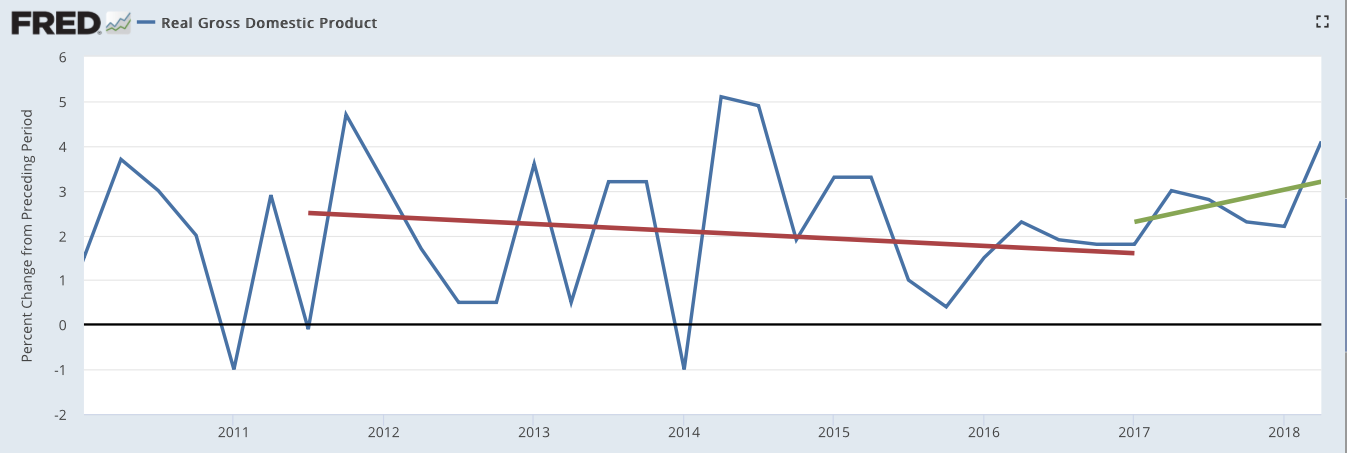
Real GDP growth rate from 2010 to the second quarter of 2018. Red line is the linear trend from Q4 2011 to Q1 2017. The green line is the linear trend from the start of the Trump administration to Q2 2018.
St. Louis Federal Reserve District Bank / FRED
I have just updated my leading and coincident economic indicators. It is now time to make sense of the tales they are trying to tell us. Right now, that tale is becoming a rousing, encouraging epic, stirring us to great hope. Nevertheless, it is not without problems, particularly with a possible, pending international trade war.
Economic Growth Continues to Buildup Steam
Since the last time I looked at the general economy in the post U.S. Economy and Stock Markets, March 2018, the economic indicators I follow have not changed much in status. I assign a status of bearish, neutral, or bullish to each indicator according to whether they indicate respectively a possible recession, no direction, or economic growth. Only two of my twelve leading indicators have changed, albeit in the wrong direction. New building permits switched from bullish to bearish, and the change of the national debt to GDP ratio went from neutral to bearish. None of my seven coincident indicators have changed status with six bullish and one neutral.
Other than those two worrisome indicators, all the rest show an increasingly strong and growing economy. Let us take a look at some of the more important indicators. There is no better way to start than with the Federal Reserve’s own coincident index of U.S. economic activity, shown in the time plot below.

Image Credit: St. Louis Federal Reserve District Bank / FRED
Throughout the period shown from the middle of 2014 to the second quarter of 2018, the actual index (the blue curve) has increased. Nevertheless, during the last two years of Obama’s administration, the increase was continually slowing, as shown in the index’s percent change from the same period a year ago (the red curve). This slowing was halted during the first year of Trump’s administration, and the annual rate of change has been rising since the passage of the Tax Reform and Jobs Act in December of 2017. This indicates an accelerating increase of current economic activity during the Trump administration.
How about the future? Below is the St. Louis Federal Reserve Bank’s Leading Index for the United States over time. It is a composite index that is a weighted average of economic variables that increase before the economy grows, and decrease just before GDP declines.

St. Louis Federal Reserve District Bank / FRED
Clearly, this index was declining throughout the last three years of the Obama administration and most of the first year of the Trump administration. However, beginning around October of 2017, the index has been trending upwards. This points to accelerating future growth.
These two indices are validated by the history of GDP growth over the past decade, shown below.

St. Louis Federal Reserve District Bank / FRED
The Obama administration had a declining trend in growth and ended up with a growth rate under 2%. In contradistinction, the Trump regime has had a rising growth trend, ending with 4.1% growth in Q2 2018.
Why do we see these differences in the economic results of the two administrations? Progressives and Democrats are saying Trump’s much better results are due to an evanescent “sugar high” caused by the December 2017 Tax Cut and Jobs Act (TCJA). They say the repatriation of capital from overseas because of TCJA will result only in stock buybacks and dividend payouts, but not in increased investment in corporate productive capacity. They say the same about the large tax cuts directly given to companies of all sizes by TCJA. What does the economic data have to tell us about this disagreement? In fact that data is dispositive in settling that argument in favor of Trump and the Republicans.
Consider first the progressive claim that companies will not reinvest their tax cuts and repatriated capital back into productive capacity. If that were true, any new orders for capital equipment and durable goods by companies would not be growing at faster rates. Below is the plot for U.S. new orders of capital equipment versus time.

Image Credit: St. Louis Federal Reserve District Bank / FRED
This plot unambiguously tells us that productive investments were falling under Obama, and are sharply rising under Trump. Just to drive that point home, take a look at the year-over-year percent change for capital goods new orders.

St. Louis Federal District Bank / FRED
Just before Trump’s election, capital investments were falling at a roughly -4.5% annual rate. Just after his inauguration they were rising at a +3.2% rate. The sharp rise between those two events can only be explained by corporate anticipation of a much healthier economic environment under Trump. By the end of the second quarter of 2018, capital investments were growing at a +8.3% rate.
Similar remarks can be made about new orders for durable goods, shown below.

Image Credit: St. Louis Federal Reserve District Bank / FRED
Progressives are also claiming individuals are not benefiting from Trump’s policies. According to House minority leader Nancy Pelosi, most people are receiving only “crumbs.” This assertion is belied by two sets of data: the headline unemployment rate (U3) and total personal income excluding transfer payments. These are both plotted below.

Image Credit: St. Louis Federal Reserve District Bank / FRED
Clearly, the unemployment rate has fallen considerably faster in the first year of Trump’s administration than in the last year of Obama’s.

Image Credit: St. Louis Federal Reserve District Bank / FRED
Real personal incomes were falling on average during the last three years of Obama’s government, but have been increasing fairly consistently throughout Trump’s. One extremely important aspect of all this is this plot depicts real personal income less transfer payments. This means first that inflation is taken out of of the personal income, that it is real income; and second, it means the personal income does not include transfer payments from welfare programs. The people earned the income by producing something in the economy. This means the income growth is sustainable as long as the economy does not contract, and will continue to grow as long as the economy grows.
Other economic indicators — such as the inventory-to-sales ratio, manufacturing jobs, the ISM Purchasing Managers Index, and copper prices — flesh out this picture but do not change it. The fundamental fact is that the economy is growing in a healthy manner again because companies have been persuaded to invest. It is in their interest to invest in increased production because:
- They can do so at less cost in time and money because of a huge reduction in government regulations. Even before the Tax Cuts and Jobs Act, Trump has been busily deconstructing the regulatory state.
- They can keep a larger fraction of their earnings after taxes because of the Tax Cuts and Jobs Act. Not only have their taxes been directly cut, but the U.S. tax system is being changed from a world-wide tax system to a territorial tax system. This brings the U.S. into conformity with the rest of the developed world. In a world-wide system a multinational company is taxed first by the country in which the earnings were made, and taxed a second time by the U.S. government when those profits were returned (repatriated) to the U.S. This system gave American multinationals irresistible incentives to keep overseas profits in overseas accounts, to be invested in overseas projects. With the switch to a territorial system, multinationals can return their foreign profits to the U.S. without the second taxation, to be invested in the U.S. economy. On foreign earnings already accumulated a greatly reduced one-time tax will be assessed — 15.5% on monetary assets and 8% on all other assets. Future foreign earnings will not be taxed. By all accounts, American multinationals are responding in a big way.
Right now, the American economy is sizzling hot, and it is going to get hotter.
Possible Future Problems With An International Trade War?
One conceivable complication that might ruin this beautiful picture is a possible international trade war. Nevertheless, any pain inflicted on Americans and U.S. companies through tariffs would be dwarfed by the pain visited on our trade opponents. This is partially because we export less to other countries than we import.
Let us take China as an example. This is a particularly important example since China now looks to be our most probable trade war opponent. We will consider Europe and our NAFTA trade partners later. Below is a plot over time from 1990 to 2017 of U.S. imports from and exports to China.

Data Source: The U.S. Census Bureau
Clearly, American imports of Chinese goods are much larger than U.S. exports to China. Apparently China would be more vulnerable to U.S. import tariffs than the U.S. would be to a Chinese increase in import tariffs on American goods. Chinese businesses would lose far more demand for their products than U.S. companies would. Since Chinese trade with the U.S. (and vice versa) is a much larger fraction of China’s GDP than of the U.S. GDP, China’s economy would take the greater hit. This assertion is verified by the plot below.

Data Sources: The U.S. Census Bureau and the World Bank
The increase of import tariffs would be a much bigger club for the U.S, to wield against China than the other way around. Trump has made clear from his statements he does not advocate increasing American import tariffs for mercantilist reasons. Instead, he envisions tariffs as a blunt instrument to bludgeon trade partners until they agree to mutually lower tariffs and non-tariff barriers.
In addition, this would be a very bad time for China to suffer such a trade war. Its companies are burdened by huge debt loads created by over-investment in production for which there is no demand. China’s economy is very vulnerable to further cuts in demand.
Even before Trump, some American companies with overseas production facilities had decided to return that production to the United States. This was primarily because of increases in overseas wages and in transportation costs back to the U.S. However, China’s increasing economic problems combined with the possibility of prohibitive American import tariffs and changes in U.S. taxes might swell that return into a flood.
Other trade war threats with Europe and our NAFTA partners seem to be subsiding or at least postponed. Last week (Wednesday, July 25), President Trump met with European Commission President Jean-Claude Juncker. They agreed to declare a truce and delay all increases in tariffs as long as negotiations for a permanent solution continued. They also agreed that what they should work toward was a trade environment with tariffs set to zero, no non-tariff trade barriers, and no government subsidies for private companies. In addition, they seemed to agree the EU should buy more American soybeans and liquified natural gas. The prognosis for the renegotiation of the North America Free Trade Agreement (NAFTA) is more guarded, with a final solution delayed at least until after the midterm elections in November.
If Trump can succeed in keeping the trade war beast in chains, our immediate economic future looks bright indeed.
Our Volatile Stock Markets
Ever since last January our stock markets have become very volatile. The volatility increased in early March with Donald Trump’s announcement that he planned a 25 percent tariff on foreign steel imports, and 10 percent on aluminum imports. With the seeming declaration of a trade war with most of our trade partners, the stock markets became erratic. This can be seen in the two plots below.

Courtesy of StockCharts.com

Courtesy of StockCharts.com
As time passed, investors became more used to the idea that Trump was using tariffs as a negotiating tool (a bludgeon, if you will), and he was actually fighting for an international environment where the foreign tariffs on our exported goods would the same as our tariffs on their goods. As that happened, the volatility — both intraday and between days — gradually reduced, and both indices have resumed an increasing trend.
We are in the midst of the Q2 2018 earnings season, and the earnings look outstanding! In the end, the major determinant of stock valuations is the earnings per share for the company. There are a thousand and one other factors affecting stock values of course, but they are important for the way they influence future earnings per share. That being the case, we are probably in the midst of a very extended stock market boom.
That is, we can expect an extended stock market boom, assuming Trump can keep that evil trade war demon chained to the wall.
Views: 1,880


