


Global Warming Teaches Humility
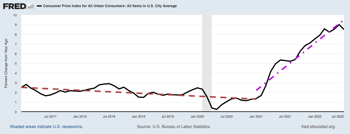
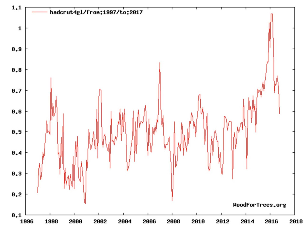
The Hadcrut4 global land and ocean temperature anomaly for 1997 to the present. The Hadcrut4 data set is maintained by the Climatic Research Unit of the University of East Anglia. The vertical axis is in units of degrees centigrade.
Watts Up With That? / Climatic Research Unit of the University of East Anglia
Nature, with its often mind-boggling complexity, has a way of teaching us humility from time-to-time when she fails to behave like we expect. She has done it yet again to Anthropogenic Global Warming (man-caused global warming or AGW) believers and skeptics alike with recent temperature data.
The Data
The global warming data everyone is fighting over is illustrated in the plot above. This data set, calculated and maintained by the Climatic Research Unit of East Anglia, is just one of five different data sets of globally averaged temperature “anomalies” (differences of the averaged temperature from some other temperature deemed “normal”), but they all pretty much show the same thing. A list of all the data sets together with links to their associated websites is shown below.
- The University of Alabama, Huntsville (UAH) data set.
- The Remote Sensing Systems (RSS) group data set.
- Data set from NASA’s Goddard Institute for Space Studies (GISS).
- Data set from the National Climatic Data Center (NCDC) of the National Oceanic and Atmospheric Administration (NOAA).
- The Climatic Research of East Anglia (HADCRUT) data set.
As an example of a data set that fundamentally gives the same picture as the HADCRUT data set, along with some interesting differences, consider the UAH data set shown below.

University of Alabama, Huntsville
The cause of all the furor is the spike in temperatures starting at the end of 2015 and persisting until the first half of 2016, after which it has been rapidly dropping. This temperature spike cries out for explanation by the skeptics of AGW, teaching us to be humble about our level of understanding. The AGW enthusiasts on the other hand seized on the evidence of renewed warming at the beginning of the spike, but are now learning humility as the global temperature average rapidly falls.
Now focus on the Hadcrut data set at the top of this post, particularly on the temperatures from 1997 to 2014, just before the start of the temperature spike. You can almost pick out with your eye a horizontal trend line that would be a least-squares fit to the data. [Hint to the mathematically challenged: such a line would have roughly as many data troughs below it as data peaks above it.] This is the famous (or infamous, depending on your point of view) “pause” in global warming from the late 1990s to at least 2014. From the Hadcrut data, one would judge the pause lasted at least from 1997 to 2014, a period of 17 years.
Now, transfer your attention to the UAH data set just above. During that same period of warming pause, it shows a number of periods during which the temperature anomaly was actually negative: the planet was cooling during those short periods. Part of the disagreement is due to a slightly different choice of “normal” temperature used to calculate the anomaly. However, as some of those troughs are deeper than -0.2 degrees celsius (the lowest the Hadcrut data shows is close to +0.2 degrees celsius), a change in zeroes is not sufficient to explain the difference. When faced with such a discrepancy, I would trust the UAH data more since it is derived from satellite measurements; the Hadcrut data is based on surface station measurements, which has a number of problems including the need to interpolate temperatures over large areas of the Earth’s surface. See here and here and here and here and here and here and here for criticisms on inaccuracies from ground stations.
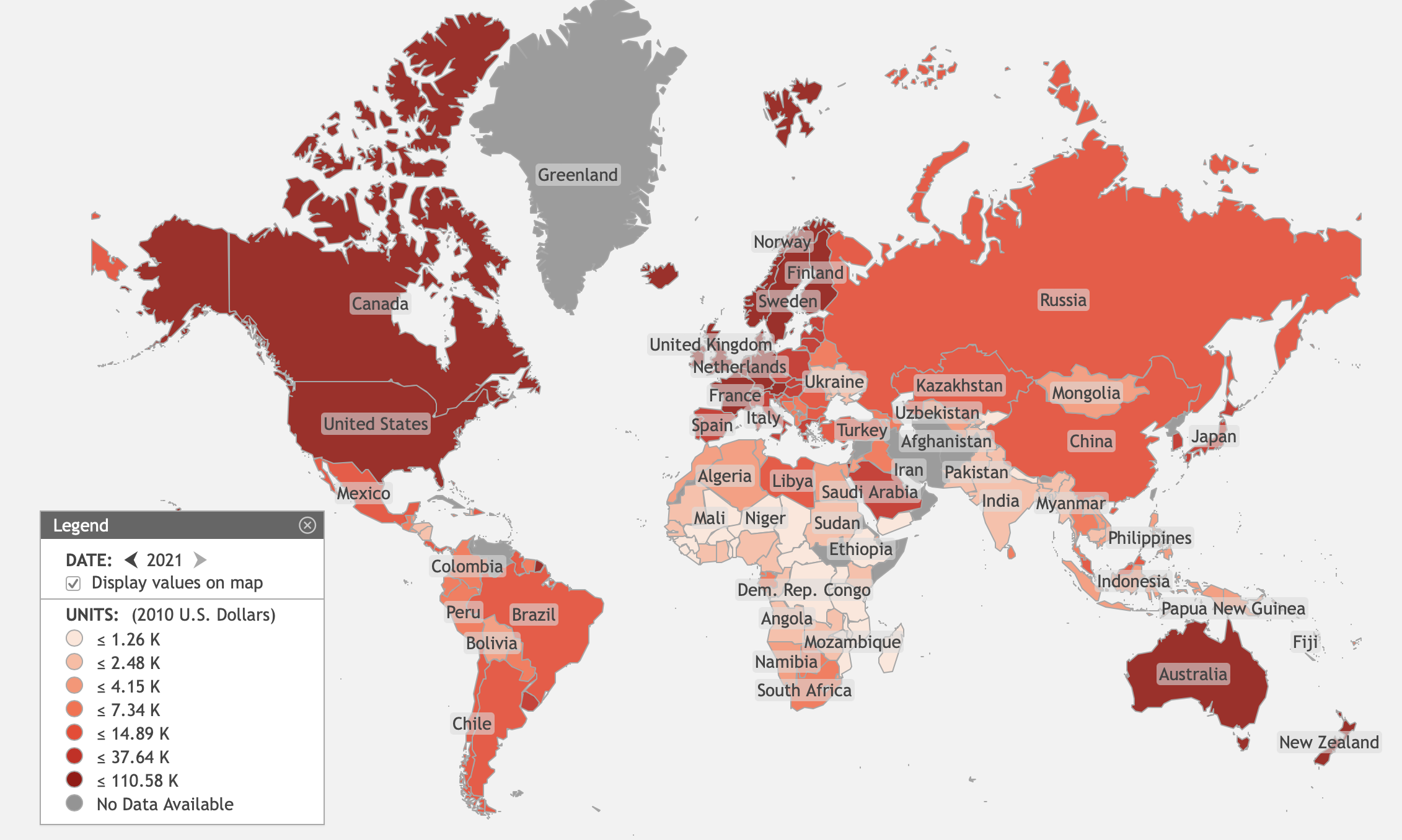
Next, let us expand our time horizons a bit using the Hadcrut data. Below is the temperature anomaly they have derived from around 1850 to the present, with a helpful note that the 2015 temperature spike is the warmest temperature in modern record. (Actually, there is a lot of evidence of even warmer periods in prehistory, long before man could have done anything to heat the atmosphere.)

Climatic Research Unit, University of East Anglia
While the exact details of what the temperatures have been might vary between data sets, this graph shows a number of features on which everyone agrees. First, a feature not shown on the graph is the period of the Little Ice Age, generally accepted to have lasted from around 1300 to roughly 1860. Trusting the Hadcrut data above, one would think the Little Ice Age actually ended around 1910. There was then a period of warming from 1910 to around 1940, followed by a period of slight cooling from 1940 to about 1975, which was in turn followed by another period of about 25 years of warming from 1975 to the late 1990s. Then came the famous (or infamous) global warming pause (excluding the 2015 spike) from the late 1990s to the present.
What this strongly suggests is that there are at least two different cycles with different periods (there can easily be more) beating against each other. First, there is a very long term process with a period between 600 and 1000 years (big error bars!), which had a warming phase between roughly 950 to 1250 called the Medieval Warm Period, followed by the cooling phase called the Little Ice Age from 1300 to around 1860 (1910?). We are currently in the warming phase of this long term process, which should continue warming the planet until sometime between 2200 and 2400. Since this periodic warming-cooling cycle predates the industrial revolution, it is something natural, not created by man.
Then, there is a second cycle with a period of 60-70 years, with half periods of warming or cooling of roughly 30-35 years. When added to the dominant long-term cycle, we observe 30-35 years of warming followed by 30-35 years of gentile cooling or a warming pause.
Why the AGW Explanation Is Not Believable
Why should we not believe that man has created the current warming by injecting carbon dioxide into the atmosphere? The AGW believers have postulated the overwhelming and fundamental cause of global warming has been man’s emissions of CO2 into the atmosphere. Certainly, something is causing carbon dioxide atmospheric concentrations to increase, as evidenced by the graph below. Seeing that graph, no one could deny that human emissions and atmospheric concentrations are highly correlated. However, there is a very real question whether humans have been the primary sources. More about that shortly.

Nevertheless, you should also ask yourself, is atmospheric CO2 the primary cause of atmospheric heating? If CO2 were the most fundamental cause of global warming, then the linear increase of carbon dioxide concentration should induce at least a linear increase in temperature. Yet what we see in plots of temperature versus time is much more complicated. From 1975 to close to 2000, we do indeed see global warming, but then what explains the global warming pause after 2000 while CO2 concentrations continued to increase linearly with time?
Any explanation for global warming must do much more than just explain the actual warming. It must also explain why the global warming is episodic, why there are at least two periods in the last 100 years where we actually had some cooling or the warming had paused.
As it turns out, such a theory, having absolutely nothing to do with carbon dioxide concentrations, does indeed exist. The argument is presented in the post Solar Wind, Cosmic Rays and Clouds: The Determinants of Global Warming, so I will only present a bare-bones synopsis here. The theory, which is confirmed by both observations and experiments, is that the 30-35 year periods of global cooling or warming pause, followed by similar periods of global warming, is caused by similar periods of solar power activity. When the Sun is quiescent, the solar wind is not intense enough to drive high energy cosmic ray protons away from the interior of the solar system. High intensity cosmic ray fluxes penetrate deep into Earth’s atmosphere, ionizing particulates that act as cloud nucleation centers, around which water droplets are bound by electrostatic attraction. The increasing planetary cloud cover then acts as a sun shade, reflecting the Sun’s radiation back into space, cooling the planet.
During periods of global warming, the situation is exactly the opposite. The Sun becomes more active, sweeping much of the incident cosmic ray flux away from the planet, causing lower densities of cloud nucleation centers, decreased cloud cover, and therefore more solar radiation heating the Earth.
There is yet one more piece of evidence available found by comparing correlations of atmospheric CO2 concentrations with air temperature and with oceanic water temperature. In the post Most Of The Rise In CO2 Likely Comes From Natural Sources, it is shown that increasing CO2 concentrations have a much greater correlation with sea temperatures than with the HadCRUT4 air temperatures. This is indicated by what is called the coefficient of determination, r2, which for a linear least squares fit is related to the root-mean-square (RMS) deviation of the temperatures to the linear fit. When r2=1, the linear regression perfectly fits the data and when it is zero the line does not fit the data at all. The r2 for the the correlation of CO2 concentrations with HadCRUT4 air temperatures is 0.05386, while the r2 for the the correlation of CO2 concentrations with sea temperatures, the HadSST2 series, is 0.5528, ten times as large as the correlation with air temperatures.
How can this be? The only plausible explanation is that it is sea temperatures driving most of the increase in observed CO2 concentrations, not CO2 concentrations driving an increase in air temperatures. The solubility of CO2 in sea water decreases as sea temperatures increase. When the sea warms, CO2 is driven from solution into the atmosphere. We can interpret this only to mean that the predominate increase in CO2 is from the seas warming, not from human emissions.
Yet, we are still left with the reality of the 2015 spike in globally averaged temperatures. How can we explain that?
A Possible Explanation for the Temperature Spike
Whatever the explanation for the temperature spike, it is pretty safe to say it has nothing to do with the sun. All of what we have observed is that since just before the turn of the century, the Sun has been becoming increasingly quiescent with a consequent decrease in solar wind intensity, causing an increase in the intensity of cosmic ray protons penetrating the atmosphere. The latest data on cosmic rays measured by weather balloons launched by Earth to Sky Calculus, a student group affiliated with Spaceweather.com, is shown below.

Image Credit: spaceweather.com / Earth to Sky Calculus
Atmospheric cosmic ray intensities increased throughout 2015 as a consequence of the decreasing solar wind, which implies a continuation of cooling/warming pause. Therefore, whatever caused the temperature spike had absolutely nothing to do with an increasingly quiescent Sun.
One possible explanation says that the spike was caused by a redistribution of thermal energy from equatorial regions of the Pacific Ocean to the atmosphere. This is during the El Niño phase of the El Niño-Southern Oscillation (ENSO), sometimes called the warm phase of ENSO. The opposite, cold phase of ENSO is often called La Niña. La Niña is a condition of unusually cold ocean surface temperatures compared with El Niño. Just as El Niño couples to and warms the atmosphere, La Niña couples to and cools the atmosphere. El Niño has just ended and La Niña, if history is to be believed, is about to begin.
Could some spike in CO2 emissions in 2015 have caused the temperature spike? There are a couple of problems with this explanation. Although many have tried to make his argument (see here and here and here and here), the CO2 concentrations corrected for seasonal variations continues to increase linearly. You can see this in the CO2 concentration time plot from the Mauna Loa CO2 measurements by NOAA, as shown below. There was no spike in CO2 emissions.

Earth System Research Laboratory / NOAA
The black curve is a centered-moving average of the data in the red curve. NOAA’s explanation for the difference between the red and black curves in the plot above is the following:
In the above figure, the dashed red line with diamond symbols represents the monthly mean values, centered on the middle of each month. The black line with the square symbols represents the same, after correction for the average seasonal cycle. The latter is determined as a moving average of SEVEN adjacent seasonal cycles centered on the month to be corrected, except for the first and last THREE and one-half years of the record, where the seasonal cycle has been averaged over the first and last SEVEN years, respectively.
In addition, once CO2 is in the atmosphere, it can only be taken out again by being absorbed by plants or by going into solution in the oceans and other bodies of water. However, increased amounts of CO2 can go into solution only if the water becomes colder, not warmer. This means CO2 emitted into the atmosphere tends to stay around for a long time. How then to explain the subsequent collapse in globally averaged temperatures in less than a year?
Whatever the explanation, it is now over. Globally averaged air temperatures are again falling to more of what we would expect with a Sun whose power output is currently decreasing.
Views: 2,434