


The U.S. Economy and Stock Markets, June 2016
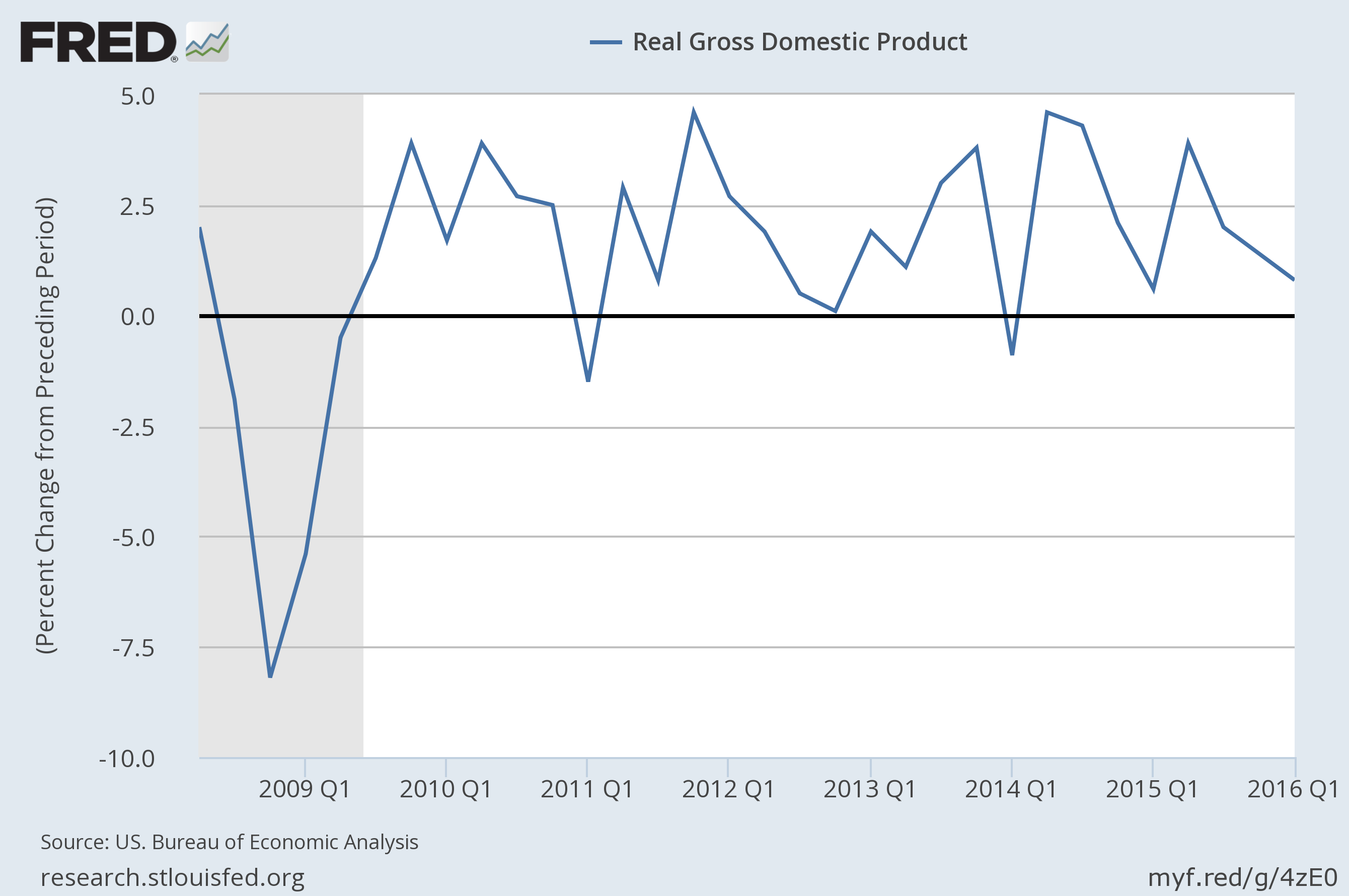
Real quarterly, annualized GDP growth rate in percent from Q1 of 2008 to Q1 of 2016
Image Credit: St. Louis Federal Reserve District Bank/FRED
Having just updated my Leading Economic Indicators and Coincident Economic Indicators pages, now is an appropriate time to do one of my periodic reviews of the health of the U.S. economy. In addition, I shall puzzle some more on the historically anomalous behavior of the stock markets.
U.S. Economy is Still Faltering
The U.S. economy is still faltering, just as it was during our last review in April. As you can see in the graph at the top of this post, the grand daddy of all coincident indicators, the real GDP growth is currently close to zero (0.8 percent) and is falling, which makes it a bearish coincident indicator. Among the twelve leading indicators I am following, two are bullish (signaling a growing economy), two are neutral, and eight are bearish (signaling a contracting economy). Giving a score of +1 for every bullish indicator, zero for every neutral indicator, and -1 for every bearish indicator, we obtain a coarse evaluation of -6 bearish. Going through the same exercise with my six coincident indicators, I find one bullish, three neutral, and two bearish indicators, for a coarse score of -1 bearish. I would interpret this to mean the economy has barely begun an economic contraction according to the coincident indicators, but the leading indicators indicate great economic troubles ahead of us.
We can get more detailed information about the economy by looking at some of the more important indicators in detail. To my mind, the more important of the two bearish coincident indicators is the Federal Reserve’s Labor Market Conditions Index (LCMI), whose average monthly change is plotted versus time in the graph below.

Image Credit: St. Louis Federal Reserve District Bank/FRED
It is this change in the LMCI that actually unerringly marks periods of recession with troughs of the curve centered on periods of recession. To demonstrate this fact, the Federal Reserve divisions of Research and Statistics and of Monetary Affairs calculated this statistic from the year 1975 to 2014 and displayed it in the plot below.

Image Credit: Divisions of Research & Statistics and Monetary Affairs, Federal Reserve Board
Going back to the plot showing the average LMCI change more recently, you can see the great trough at the depths of the Great Recession around January 2009. You can also see the LMCI is currently falling and its average monthly change is a -4.8, the lowest it has been since the Great Recession. This index contains within it information on:
- Unemployment and underemployment indices
- Employment indices
- Lengths of workweeks
- Wages
- Job Vacancies
- Hiring
- Layoffs
- Job Quits
- Surveys of consumers’ and businesses’ perceptions
Among the leading indicators I would single out the bearish indicators of the St. Louis Fed’s leading index for the United States, the velocity of the M2 money supply, manufacturers’ new orders for non defense capital goods ( a proxy for business investment), copper prices, and the change in the ratio of the national debt to GDP as being more important. In this group the business investment proxy and change in the national debt to GDP ratio are the most important. I will focus on them.
The plot of my proxy for business investment, the manufacturers’ new orders for non defense capital goods (excluding aircraft) is shown below.

Image Credit: St. Louis Federal Reserve District Bank/FRED
The trend of this data is clearly falling with a year-to-year decline currently of about -4 percent. This data backs up a rather general observation that U.S. businesses are just not investing in new productive capacity inside the United States. Instead, they are borrowing large amounts of cheap money to buy back their own stock. Decreasing their shares outstanding increases the earnings per share (even if those earnings may have decreased) and therefore decreases their price-to-earnings ratio. Since increases in productive capacity are totally dependent on investments, it is no wonder GDP growth is in such trouble.
The second of the most important leading indicators is the national debt to GDP ratio, which is displayed versus time in the plot below.

Image Credit: St. Louis Federal Reserve District Bank/FRED
Recently, the national debt/GDP ratio and its rate of increase have markedly increased, and the Congressional Budget Office has recently informed us in their annual budget and economic outlook report that the budget deficit will again begin to rise this year – approximately five years early – after six years of decline. Currently the national debt is 105.7% of GDP, and is increasing at a year-over-year rate of 2.8%. We know from the researches of Carmen Reinhart and Kenneth Rogoff that anytime sovereign debt exceeds about roughly 80% to 90% of GDP, government borrowing to finance deficit spending begins to crowd companies out of financial markets and begins to kill private investment. In fact, as I related in The Thoughts that Haunt Me, the payment of interest on the national debt, together with payments for entitlements, will ultimately absorb every single penny of government revenues sometime in the 2020s, unless something drastic is done.
Some Periodic Behavior of the Economy
Some fascinating and revealing periodic behavior in the economy is shown in the plot of total business inventories to sales ratio versus time, as shown below.

Image Credit: St. Louis Federal Reserve District Bank/FRED
This plot is rather busy with all the fluctuations in it, but if you focus on the blue curve, you will discern a very important fact. Ever since the beginning of 2011, at the beginning of each year there is a very large spike in the inventories to sales ratio, followed shortly by a crash in the ratio. Nevertheless, even after the crashes, the ratio remains substantially above one. This means businesses are making substantially more of their products than is being sold. It would appear that towards the end of each year, companies become optimistic about the economy’s prospects for the coming year. As a result they ramp up production in anticipation of growing sales in the new year, which unfortunately do not materialize to the degree they expect. Then instead of being sold, the produce goes into costly inventories. To survive, companies must then cut back production until the inventories are pruned back.
Notice that the amplitudes of the year-opening spikes are increasing with each year, giving the impression of a growing instability. Could it be that company officers are listening to Keynesian optimists eternally predicting that this is finally the year the economy will break out of its doldrums? If they believe it and have faith in Keynesian policies, they might well ramp up production at year’s end for the new year. The results of this faith being constantly disappointed with increased inventories must have a great deal to do with the lack of business investment. If increased inventories result from current productive capacity, why invest more to increase that capacity?
U.S. Stock Market Behavior
Because of the faltering economy, U.S. corporations have been in an earnings recession for more than a year. Moreover, the decline in average corporate earnings has been increasing quarter-by-quarter. Profits fell -3.3% in the third quarter of 2015 from the second, and they declined -8.1% in the fourth quarter from the third, so the profit decline is accelerating. Yet corporate buy-backs of their own stock has been the stock markets’ single biggest support over recent years, as evidenced by the plot below showing corporate buy-backs as a function of time.

Image Credit: Bloomberg.com
The superimposed bar chart shows the quarterly investment fund flows, the other big institutional investors in the markets. Notice for the earliest years on the chart, 1998 to about 2004, corporate buybacks were steady and institutional fund equity buys were generally larger or of the same size as the buybacks. The one exception is the period of economically parlous times introduced by the recession of 2001 and punctuated by the terrorist attacks on September 11, 2001. Beginning in 2004 corporate buybacks increased in size and began to dwarf institutional fund flows. I suspect this was because companies were beginning to experience increasing government roadblocks to economic activity and found it easier and more profitable to buy back their own stocks to increase their earnings per share. This continued until the financial crisis of 2007-2008 and the Great Recession that followed. After the recovery corporate buybacks continued their climb, dwarfing any positive fund flows. The funds have in fact been selling stock more often than buying since the recovery. Corporations appear to be the dominant players currently.
Yet, how long can this continue with corporations being in an earnings recession? The increase in stock valuations currently has had little to nothing to do with economic growth or the economic value of the companies. Instead, what has happened is that cheap money supplied by the Fed has fueled corporations in buying back their stock, thereby inflating a stock market asset bubble. The first inkling this situation may not continue for much longer may have come with the microscopic 0.25% interest rate hike last December. If interest rates increase, companies faced with decreasing revenues may not qualify for no-longer-cheap loans for more stock buy-backs. This prospect may have had a lot to do with the market corrections we saw earlier in the year.

&

Since the correction, the stock markets have risen back approximately to their previous highs around which they have been moving in a narrow band. Yet stocks are presently greatly overvalued. Once corporations no longer find it profitable to buy back their own stock, either because (1) they can not fund the buy-backs with their own revenues, or (2) they can not qualify for low-interest loans given their low revenues, or (3) the Fed raises interest rates beyond the the point where it would be profitable to borrow for buy-backs, then the demand for stocks will fall through the floor until their prices become reasonable again.
Views: 2,057