


The Rahn Curve and the Way Out of Economic Peril
Image Credit: Foundation for Economic Education, fee.org
Feeling rather morose after writing the post What is the Economy’s Condition?, I was mulling over what I could possibly write to suggest how we could get out of the bad economic situation we are in. Preferably, something that has not already been suggested an innumerable number of times before by any number of superb conservative minds. (If by chance there are any progressives reading this post, I acknowledge you are misguided enough to believe the application of the adjectives “superb” and “conservative” to a single mind is a contradiction in terms. Nevertheless, humor me and read on!)
To be persuasive, the theme could not be merely a repetition of neoclassical philosophic points to counter the points of Keynesians. Instead the subject should be something that was backed by observed data, rooted deeply in the real world. Already, we can see the Keynesians, marshaled by the eminent Larry Summers, disinterring the ancient Keynesian idea of secular stagnation to explain how Keynesian stimulus programs are just not accomplishing anything. We can not allow them to get away with that without pushback, but that pushback should be rooted more in observed data, rather than neoclassical doctrine.
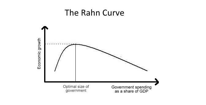
At this point I started to think about the Rahn curve, which although implied by neoclassical doctrine, nevertheless is something that we should be able to construct from observed data. Shown above in the post’s featured image, the Rahn curve is a plot of the economic growth rate as a function of the government’s size in terms of its expenditures as a fraction of GDP. In several ways it is analogous to the Laffer curve, which is a theoretical plot of government revenues as a function of government tax rates, as shown below.

The Laffer curve is a plot of government tax revenues versus tax rates. If government revenue is an increasing function of the economic growth rate and government spending is an increasing function of the maximum tax rate, then the mapping from the Rahn curve to the Laffer Curve would be one-to-one and onto. Therefore, if the existence of one curve could be demonstrated, the existence of the other curve would be implied.
Because we live in an era of big government, it would be next to impossible to find data points on the lower branch of Rahn’s curve, i.e. from no government spending to the spending point where economic growth is maximized. However, we should be able to show points on the higher branch from maximum GDP growth to the point where government spending is 100% of the GDP and economic growth is zero or negative.
To get the data to attempt the visualization of the upper branch of Rahn’s curve for the U.S., I went to the Federal Reserve Economic Database (FRED). Over the many years in which the Federal Reserve has collected data on the economy, it has become a vast treasure trove of data. On this website I have written many acutely harsh assessments of the Federal Reserve, but in gathering and organizing a vast amount of decades of data and making it available to all, the Federal Reserve deserves nothing but praise. If you would like to try your own hand at economic theorizing using the Fed’s data, FRED’s URL is https://research.stlouisfed.org/fred2/. Before you go there, however, you may wish to go to an online tutorial on using FRED developed by the New York University Stern School of Business at the URL https://fredqa.stlouisfed.org/2015/05/15/lessons-in-fred-video-tutorials-from-our-friends-at-nyu-stern/. Then you too can pontificate on economics using Fed data!
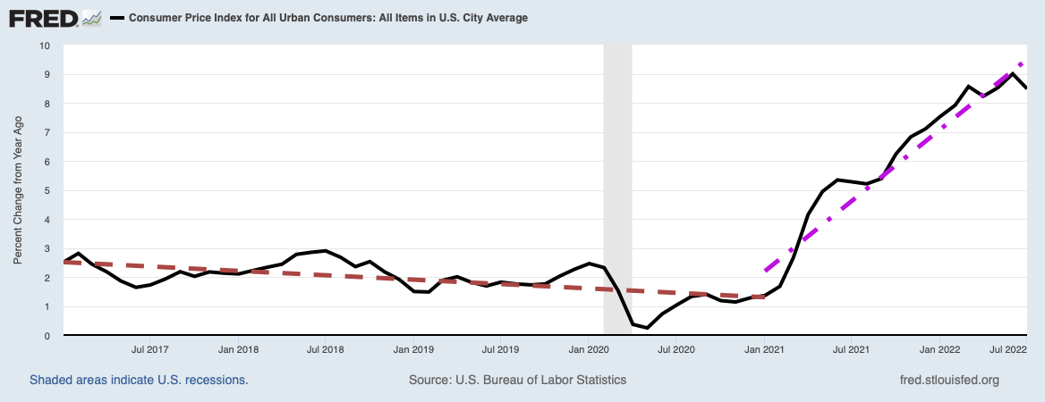
The first thing I did with FRED was to visualize the growth rate of the real GDP versus time, and government total expenditures as a percent of GDP. The result was the plot below. Although the graph labels the blue curve as “Real Gross Domestic Product”, if you look at the first set of units on the vertical axis, you will see that real GDP is plotted in units of “Percent Change from Year Ago”, i.e. as the real GDP’s year-over-year growth rate.

The first thing to note is that total government expenditures, whose coverage begins in 1960, starts at about 27% of GDP in 1960 and rises to a high of 49% of GDP in 2009. This is considerably higher than the federal government’s spending because the government expenditures plotted here also include state and local government spending. It is apparent from the graph that total government spending is a generally increasing fraction of the GDP with time. On the other hand, if you look very carefully at the growth rate curve, you will discern a long, slow decline in growth rate from about 12% in 1951 to about 2% currently. This certainly seems to place the United States firmly on the upper branch of the Rahn curve with GDP growth rate decreasing with increasing government expenditures. To more easily visualize this relationship, FRED has a wonderful facility for associating the GDP growth rate with the government spending at the same time as a single point in a plane whose y-coordinate is the growth rate and whose x-coordinate is the government spending as a fraction of GDP. When all of the points determined this way are plotted, we obtain the scatter-plot below.

Because the data is noisy due to GDP growth fluctuating with recessions and recoveries, the scatter plot does not have quarterly data points clustered tightly along a smooth curve. However, the scatter plot does show that if you were to draw a smooth curve through the middle of the point clusters around single values of government spending (the x-axis), you would indeed obtain a plot of GDP growth rate declining with increasing government expenditures as a fraction of GDP. Voila, we have verified the Rahn Curve for the U.S. economy using Federal Reserve data from the years 1960 to the present. Not only that, but from the first graph, we saw that total government expenditures as a fraction of GDP was generally increasing with time. This means that as time went on, we ensured that our GDP growth rates would fall as we increased our government expenditures faster than the GDP grew!
So what does all this suggest about how to lift my gloom by increasing the health of our economy? The trivially obvious implication is that we should drive back our position on the Rahn curve toward higher GDP growth rates by greatly decreasing government expenditures as a fraction of GDP! We can expect progressives to fight such an outcome, since such a policy would threaten their increasing control over the economy. Nevertheless, if we continue our present course of increasing government spending, the Rahn curve predicts our GDP growth will continue to fall. We would enter a period of secular stagnation, albeit for reasons far different from what Larry Summers and company imagine!
Views: 3,001