


Labor Market Not Nearly As Good As Many Think
The kind of jobs that are available? A railroad work crew in 1941 near Bellefont, Kansas.
Photo Credits: Wikimedia Commons/National Archives and Records Administration/Charles O’Rear, 1941, Photographer
Many have been touting the growth of new jobs as one of the very few bright spots in the U.S. economy. Janet Yellen has certainly said she believes that in some very recent statements. Unfortunately, in this as in some other ways, the economic optimists may have been fooling themselves.
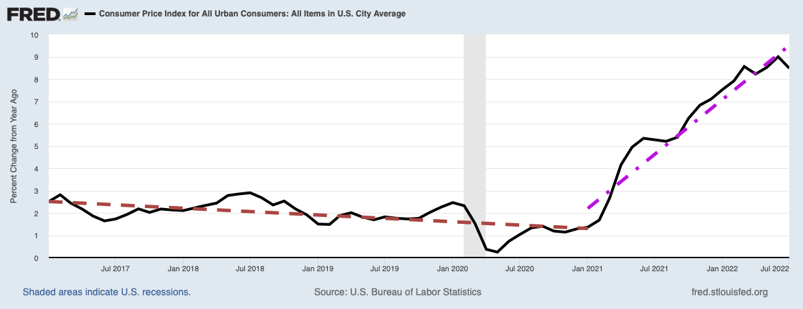
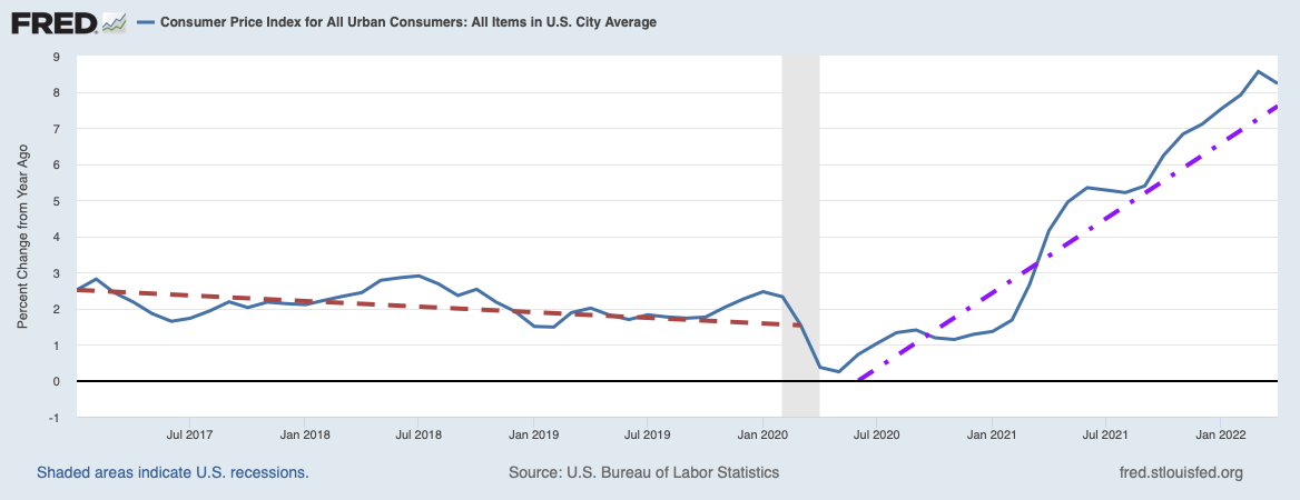
The Labor Force Participation Rate
One of the statistics optimists have been citing lately has been the labor force participation rate, which has been declining since the beginning of the Great Recession (December 2007 to June 2009). You can see it plotted below with a red trend line superimposed to show the steady decline until recently. Interestingly, all of the fluctuation peaks occurred in early summer, typically in June.

Image Credit: St. Louis Federal Reserve District Bank/FRED
What excited optimists recently had been signs the labor participation rate had bottomed out close to the trend line and had begun to rise again in January of this year, well over the trend line. However, the participation rate peaked again in its customary month of June and is now falling. Nevertheless, it peaked much higher over the trend line than previous summer peaks and one can easily persuade oneself that the current jag downwards is just a negative fluctuation on a new rising trend line. I am sure optimists must now be telling themselves this.
Unfortunately for the optimists, Chris Matthews in a Fortune Magazine post decided to rain on their parade by giving an explanation for the unusually large fluctuation peaking this June. Quoting Neil Dutta, Chief Economist with Renaissance Macro Research, Matthews took notice that the flows of people out of the labor force (discouraged workers or retirees) and flows into the work force (newly looking or new hires) are both still trending downwards. As evidence the plot below was produced.

Image Credit: Chris Matthews, Fortune/Haver Analytics, Renaissance Macro Research
The flows into and out of the labor force are given by the black and gray curves, respectively, while the labor force participation rate is superimposed in orange. Note the June peak in the participation rate is explained by a momentary upward move of the flows into the labor market and a larger than recent trend move downwards of the flows out of the labor force. After June both flows resumed their original trends downward. The flow of labor out of the market is still less than the flow into the market, so the labor force participation rate will still increase, albeit at a much slower rate. However, the two curves appear to be converging, and should the black curve dip below the gray, the labor force participation rate will resume its decline.
What can we conclude from this data? First the number of people moving into the labor force, given by the black curve, is continuing to decline. Even should the number of people leaving the labor force, the grey curve, remain below the black curve and the participation rate increases, it will be at the cost of an ever smaller work force. The fact that the flows out of the work force are steadily declining can only mean people who are working are hanging onto their jobs for fear of not finding a new job if they left, or perhaps older people fearing what retirement might bring financially. This can not be an encouraging sign.
The Change in the Labor Markets Condition Index
Is there any other way we can see how the labor markets are developing? In fact, the Federal Reserve has created an almost perfect coincident indicator of labor market health in the Labor Market Conditions Index (LMCI). More specifically, it is the average monthly change in the LMCI which shows troughs centered on recessions and peaks at moments of maximum growth. The plot of this change in the LMCI with the latest available data is shown below.

Image Credit: St. Louis Federal Reserve District Bank/FRED
Again, the superimposed red line gives the linear trend since 2014, which is clearly declining. The June peak in labor market conditions is clearly seen in a tiny peak just above the zero line of the x-axis. Note well that this peak is significantly smaller than previous peaks above the trend. This statistic, like so many others, depicts a declining economy. The healthy economy the optimists are seeing is almost certainly a chimera.
Views: 1,635