


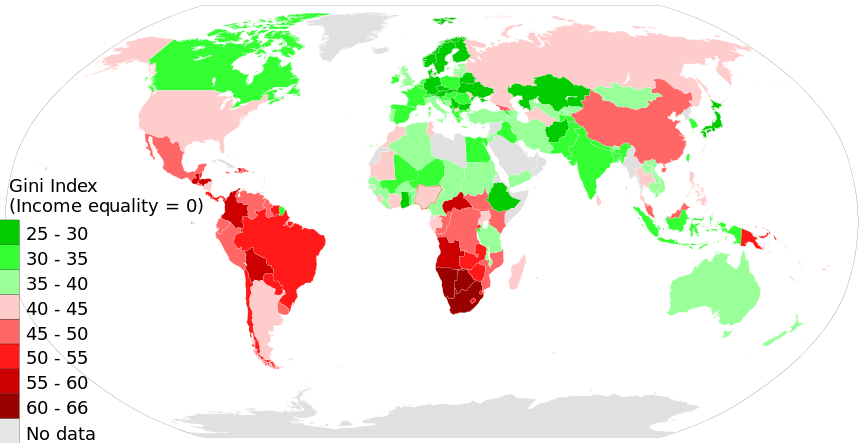
Income Inequality In the United States
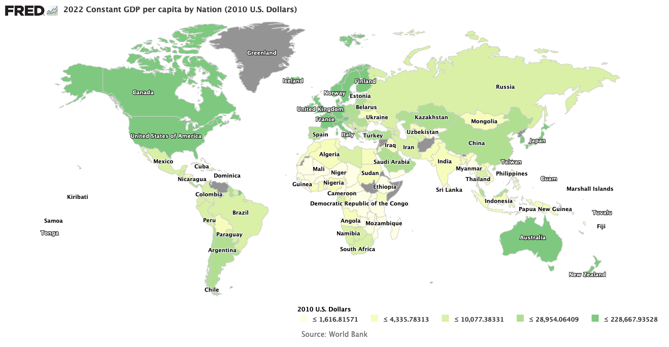
Gini Index World Map in 2014, income inequality
by country according to World Bank
Image Credit: Wikimedia Commons/M Tracy Hunter
One of progressives’ favorite conversations is about income inequality, particularly in the United States. What progressives would like us to believe is unjustifiable income inequality in the United States is unjust and leads to social instability, Above you can see a world map displaying the Gini index for various countries. The Gini index is a measure of income inequality that is zero when every household has the same income and depending on the normalization adopted is either one or 100 or 100% when income is completely unequal, as when one person has all the income and everyone else has nothing. I will discuss the definition of the index and its limitations shortly. You should be able to discern that compared to other countries, the United States is just about in the middle of the pack with roughly the same Gini index as Argentina and Russia, but with a significantly smaller Gini than China and significantly larger than all of Western Europe and Canada.
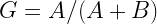
The Gini Index and Its Limitations
Named for the Italian sociologist Corrado Gini who invented it, the index has a number of limitations. The first and most obvious is that as a single scalar number, it gives no real information about the detailed distribution of income across the population. The same value can come from many different distribution curves, which we can see in a graphical definition of the index. One way of showing the detailed distribution is the Lorenz curve as shown in the figure below.

Image Credit: Wikimedia Commons/Reidpath
On the horizontal x-axis is the percent of households whose incomes, starting with the lowest, we have added from 0% to that point, and that sum gives us the vertical y-axis coordinate on the Lorenz curve, which separates regions A and B in the figure. The y coordinate of the point (x, y) on the Lorenz curve is the sum of all the incomes of the x% of the population with the lowest incomes. Let A be the area of region A and B be the area of region B. If there is absolutely no inequality, then x percent of the households have x percent of the income, and the Lorenz curve becomes the Line of Equality in the figure. As a country’s economy becomes increasingly equal, the Lorenz curve approaches the Line of equality ever closer, until finally at complete equality A=0 and B is the entire area under the Line of Equality. When there is complete inequality only one household has 100% of the income and all the rest have 0%. In that case the Lorenz curve is on the x-axis until it reaches 100% of the population, where it jumps vertically to hit 100% of the income. Then A is the entire area under the Line of Equality and B=0. The Gini index G can then be defined as
Also, the accuracy of the index is limited by how accurate the income distribution can be determined. For the integrations determining the areas A and B to be accurate, both the Lorenz curve and the GDP must be accurately known. When one tries to make comparisons between countries, these considerations make the values given by less developed countries and autocratic nations like Russia and China suspect.
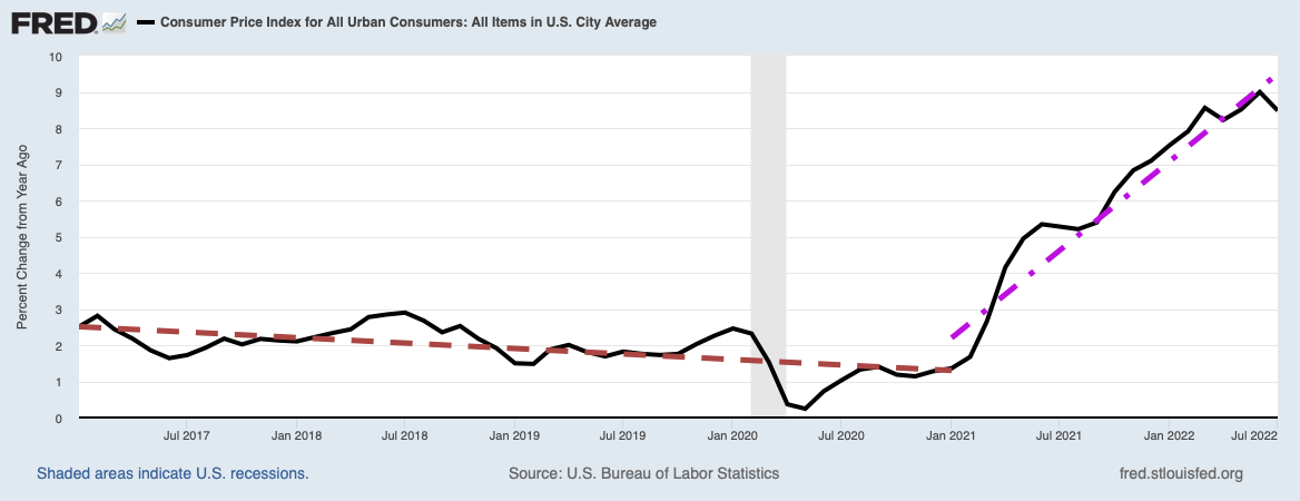
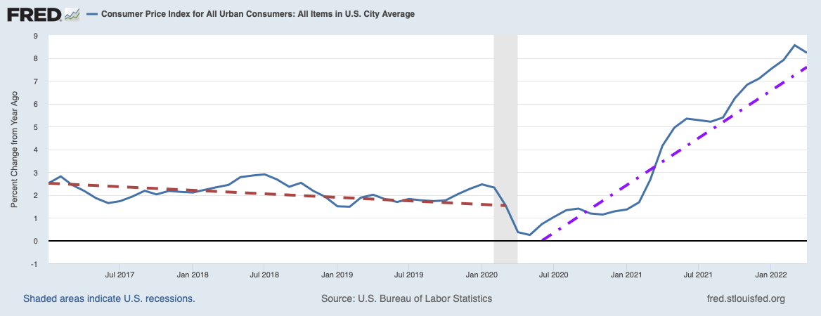
Unfortunately, the Federal Reserve has recorded the U.S. Gini index only every three years, and their data is shown in the plot below.

Image Credit: St. Louis Federal Reserve District Bank/FRED
If the Federal Reserve data is accurate, the U.S. Gini index has been relatively constant since 1994, varying about an average of 40.8, with a low of 40.35 in 1994 and a high of 41.75 in 2007. The maximum deviation from the average was at the beginning of the Great Recession with a value of 0.95, certainly a very small number compared to the total possible variation of the index of 100. Another interesting comparison is how the U.S. Gini has varied since World War II compared to the similar histories of other countries. You can consider this in the rather busy plot shown below.

While the U.S. (the gold curve) is at the top of the band of industrialized nations, it is currently about 10 above the median value of around 35. That is a significant difference to be sure, but this difference buys the United States somewhat more economic dynamism, as I will discuss shortly. Notice also that China’s Gini is rising considerably faster than that of the U.S and crossed over our Gini sometime around 2002. If you look closely, you will see India’s Gini rising at an even faster rate than China’s, although still somewhat below ours. The United Kingdom’s Gini is rising almost as fast as China’s, but is still somewhat below ours. Most of the rest of the Gini curves of industrialized countries below ours belong to the stagnant economies of Western Europe.
Causes of Income Inequality
So what are the causes of this inequality in the United States? It is fairly well known capitalism automatically and naturally creates income inequalities, partially because of the need to generate wise investments and partially to reward those who contribute the most to economic growth. This statement is not to denigrate the contributions of those who work by the sweat of their brow, but those who take the risks to start new companies, or who find the best, most rewarding ways to allocate capital are the ones who need to be encouraged the most to continue their activities. For these reasons, such entrepreneurs are rewarded the most, because company trustee boards and at least some government officials know that they are absolutely needed for continued economic growth and the maintenance of our current productive capacity. Since there is a much smaller supply of such entrepreneurs than there is of ordinary laborers, the law of supply and demand requires the economy pay a higher price for their services.
I have written on this subject in several posts, particularly in Distribution and Use of Wealth in U.S. Capitalism, The Morality of Wealth, and Morality and Capitalism. There are two common threads in all these posts. The first is that the very rich almost always consume a very tiny fraction of their incomes directly on themselves for their own needs and satisfactions. It is simply physically impossible to consume more. There is not enough time available for a billionaire to find even more things to buy to satisfy his own appetites, The second thread is that most of their wealth and yearly income is usually directed toward investments in the economy. If they direct their capital to profitable investments the economy needs, they are rewarded with even more capital to invest from their profits. If they direct capital foolishly to projects the economy does not need, they suffer losses. Those who receive the assets from those losses are those who saw the money-losing projects as positions to liquidate, and therefore demonstrated greater wisdom in capital allocation. In this way the markets continually redirect capital to those who have demonstrated they can aim capital in directions the economy needs.
However, those mechanisms causing income inequality have been with us for centuries. They can not be the full story because there has been a long-term increase in the Gini index since the early 1970s, as you can verify in the plot of the U.S. Gini index in the figure above. According to the Fed data in the figure above that, it does seem to have reached a plateau starting roughly around 1994. Nevertheless, the rise between the early 1970s and 1994 must be understood to see if we can counteract whatever caused the rise, and to avoid such rises if we can in the future. This brings up the subject of what the best ways are to reduce income inequality.
Best Ways To Reduce Income Inequality. How Much Do We Want To Reduce It?
One villain often cited as causing income inequality is the advancement of technology to increase productivity, for example by replacing human workers with robots on assembly lines, or the use of computer technology to handle inventories, eliminating the need for some accountants, warehouse workers, and supermarket clerks. Ever since the days of the Luddites (although the Luddites might not have been as anti-technology as they have been given credit), technology has been a favorite scapegoat for many. There is certainly a kernel of truth in the idea that technology is the main villain, which we can see when we view car assembly lines manned by robots.

Photo Credit: Wikimedia Commons/Phasmatisnox
Yet we can find many more villains than just the progress of technology. Everything government does to discourage business activity reduces the amount of human labor needed by the economy, and by reducing the demand for labor, decreases its costs, which are workers’ wages. We have seen ample evidence in previous posts on this website that economic activity can be greatly expanded simply by greatly reducing government intrusion into the economy. Prune government regulation (eliminate Obamacare, control the EPA, and repeal Dodd-Frank), then reform and reduce taxes, and you will see a resurgence of the economy that would bring a huge increase of new jobs. In the same vein, it would help a great deal if the Federal Reserve could be leashed so it could not attempt to goose the economy via monetary policy.
Also, all of the history of the past two centuries or so tells us that if technology advances, it creates at least as many jobs as it destroys. When technology decreased the number of farmers needed to feed the nation, it gave the means to invent the assembly line that absorbed all those ex-farmers and more.
Unfortunately, the proverbial fly-in-the-ointment of the last paragraph is the newly created jobs of today require a somewhat different kind of education that is also usually more intensive and extensive than was typically true in the past. Today we need more engineers of all types – mechanical, electrical, software – as well as physicists, programmers for additional apps of all types (yes, that includes programming for games!), biologists, doctors, nurses and many other occupations that require the use of that most useful of all computers, the human mind. As has been noted by many others, this will require a really big increase in the productivity and quality of public and private education.
Because the problems of those on the lowest rungs of the economic ladder often stem from a lack of the kinds of education required by the economy, any remedy for income inequality will require a change in welfare programs that involves education. I will suggest some (possibly useful) changes in welfare programs that might help to reduce income inequality in the next post. Yet we must always remember that until we approach a steady state economy in which all individuals pretty much have everything they need or want (which will probably be a very long time from now), we will need a great deal of income inequality to fuel future economic growth.
Views: 5,555