


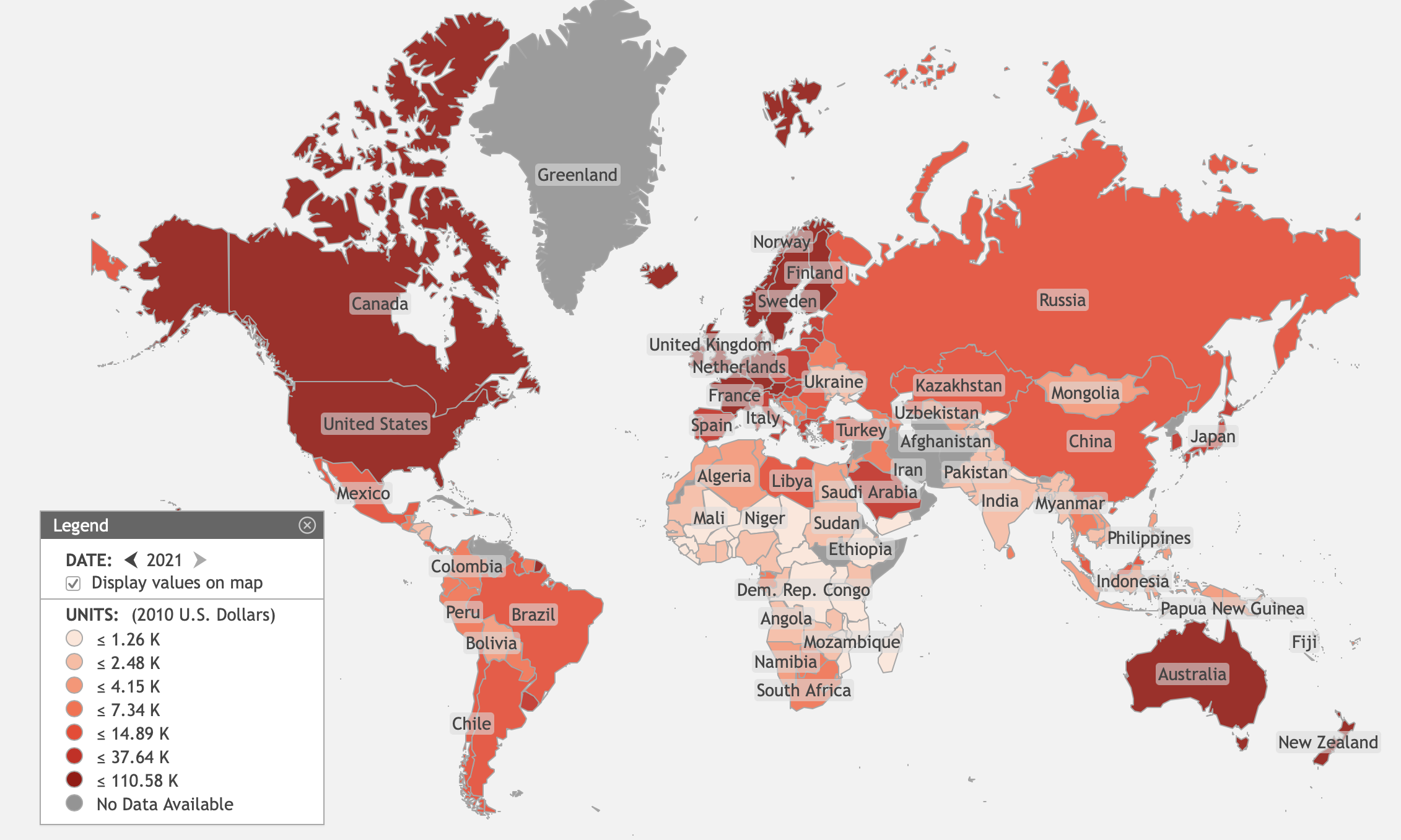

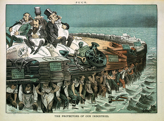


Comparing the Economies of All Countries on Earth
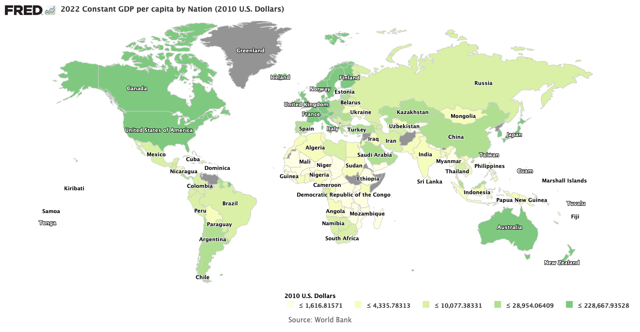
World Map of countries by per capita GDP in 2014
Image Credit: St. Louis Federal Reserve District Bank/FRED
Plus or minus a few controversial states (like Taiwan, the Holy See, and Palastine), there are around 195 countries in the world today. Each one possesses an economy that is at least slightly and sometimes greatly different from every other country on Earth. Each one is a different experiment in economic organization. What can we learn from them about what makes economies run well?
The Most Important Economic Argument in the World
The most hotly debated issue in both economics and politics today is just how much a government should intrude into and manage an economy. We can obtain important economic statistics — such as the GDP, GDP growth rate, and the GINI index — for almost all countries on Earth through the World Bank, which I will use as the source for these statistics in this essay. We can then look at how these macro aggregates vary from country to country with different levels of state economic intervention. The GDP, the Gross Domestic Product, is the sum of all the country’s economic output, the sum of all the new wealth produced during a year. It’s growth rate is the year-over-year change in the GDP in percent. Not so well known is the GINI index, a measure of how unequally the GDP is divided among people. It is a favorite statistic for the political Left, as they desire more than anything else (at least publicly) to have GDP divided equally among the population.
The GINI index is a single number derived from a curve called the Lorenz curve, illustrated in the figure below. If we focus on a position (x, y) on the Lorenz curve then the x percent of the population with the lowest incomes cumulatively receive y percent of the total GDP as an annual income. The shape of the curve in the figure below is purely notional. There is no need for the curve to be smooth as shown below; in fact real Lorenz curves almost certainly are not smooth everywhere and probably have occasional discontinuities. However, they should be piecewise continuous, so that the areas A and B are unambiguously defined in the triangle below. In terms of these areas, the GINI index is defined as
G = A/(A+B).
If the total GDP is divided in completely equal shares among the population, then the x percent of the population that has the lowest incomes (albeit the same income as every one else) have x percent of the total income (GDP), and y = x all along the Lorenz curve. The Lorenz curve then lies right on top of the line of equality in the figure.

Image Credit: Wikimedia Commons/Reidpath
Then with perfect equality of income distribution A = 0 and therefore G = 0. On the other hand, if there is perfect inequality with nobody receiving any income except for one person at the top of the pyramid, then the Lorenz curve hugs the x-axis until x = 100 percent, where the curve jumps discontinuously to 100 percent. Then B = 0 and G = 1, or 100 if as is usually the case it is scaled by a factor of 100. Assuming such a scaling, the GINI index will vary between 0 and 100, with 0 denoting total equality and 100 showing total inequality.
However, we also need another statistic that measures in some way how much the government manages the economy. No one statistic can fully capture state economic intervention because there are so many ways in which the government can intervene. If we could define an N-dimensional state space with the economy’s position along any axis being the percent of control of the government over some attribute of the economy, then the vector from the origin to the point representing the degree of government control would define the state of government economic control. To get a single number that denotes the degree of government control, one could compute the length of the vector. That is essentially what the Wall Street Journal and the Heritage Foundation did starting in 1995. To get the value of the index for any particular country, they scored each nation from 0 to 100 on ten factors of economic freedom, separated into four categories. The categories and their constituent factors are:
- Rule of Law
- Property Rights
- Freedom from corruption
- Limited Government
- Fiscal Freedom from taxes
- Government Size/Spending
- Regulatory Efficiency
- Business Freedom from Regulations
- Labor Freedom from Regulations
- Monetary Freedom from Inflation/Deflation
- Open Markets
- Trade Freedom from tariffs and non-tariff barriers to international trade.
- Investment Freedom from restrictions on the movement and use of investment capital.
- Financial Freedom from government control and interference in the financial sector, including banks.
The index value is then an average of these scores. An index of 0 denotes no economic freedom from the government whatsoever, while a score of 100 indicates a perfectly free laissez-faire economy.
My method then is to graph the economic aggregates of GDP, GDP growth rate, and GINI index for each nation versus their index of economic freedom to get a feel for the effects of government intrusion into the economy. Unfortunately, although I could get each country’s index of economic freedom for 2016, the latest economic aggregates from the World Bank are from 2014. Also, GINI indices are only available for a subset of all the countries, and then are not necessarily calculated every year. Fortunately, these indices do not appear to be very time sensitive, so when available I plot the GINI index for the closest available year.
The Evidence
The first plot I show is that of countries’ per capita GDP versus their index of economic freedom. The scatter plot below definitely demonstrates the economic superiority of capitalist free-market economies over those more directly managed by their governments.

The per capita GDP appears to hug the x-axis until the economic freedom index exceeds 60, where nations’ GDP appears to begin exponential growth with increases of freedom from the government. The scattering of country points is due to the fact that more affects the GDP size than just government controls. For example, the countries’ outputs may be affected differentially by war, availability of resources, social unrest, or climate. Nevertheless, the lesson of the plot is quite clear: As far as the size of GDP is concerned, the less government economic intrusion, the better.
But what are the effects of government control on GDP growth rates? The tale is told in the plot below.

Here the lesson is not so clear. The blue line is a linear trend of the data meant to guide your eye. From the graph we see that on the whole growth rates decline with increasing economic freedom, at least for the year 2014. There are two possible explanations I can attribute to this. First, the higher GDP producing nations generally have more mature economies than nations with lower per capita GDP, and more mature economies naturally expand slower because the easiest ways to increase production in balance with demand have already been exploited, Support for this interpretation is given if we plot countries’ GDP growth rate versus their per capita GDP.

For the year 2014 at least, the growth rate versus per capita GDP flattens out once per capita GDP reaches around $20,000.
However, a second explanation comes from the headwinds mature economies (meaning Europe, the United States, and Japan) have created for themselves through applying Keynesian economic nostrums. Historically, average economic growth in the United States has been on the order of 3 to 3.5 percent, not the average 2 percent we have seen lately. If we were to cut government’s share of the total national income by cutting both expenditures and taxes, and seriously pruned back government economic regulations, the economic stimulus produced would dwarf anything government could achieve. I would expect the blue line in the growth rate-economic freedom plot above to become somewhat more horizontal, although probably still declining because of the maturity of our economy. To back these claims up, consider the content of the posts The Rahn Curve, Hauser’s Law, the Laffer Curve and Flat Taxes; The Burden of Government Regulations; The Debilitating Effects of Obamacare; Economic Effects of the Dodd-Frank Act; and Economic Damage Created by the Fed.
Nevertheless, progressives would still protest about the inequality of income in our country. So just how much difference in income inequality is there between more socialist countries and the nations with more free market economies? Consider the following plot of the GINI index and the index of economic freedom, recalling that a GINI of 0 means absolutely no inequality and a GINI of 100 means the most extreme inequality.

This plot does not seem to give much support to the progressives’ point of view. As economic freedom increases, the GINI index generally decreases slightly, i.e. the distribution of income becomes more equal! I would recall from my posts Distribution and Use of Wealth in U.S. Capitalism and The Actual U.S. Distribution of Wealth Today that no matter whether an economy is capitalist or socialist, a certain amount of income inequality is necessary to provide for needed investments. In a purely socialist economy the unequal, excess distribution is taken by the state, while in a capitalist economy it is taken as profits by investors, who tend to be the most wealthy in society. In the United States, the very, very wealthy themselves consume only a small fraction of their wealth, with the largest fraction going to socially desirable investments.
What Can We Conclude?
The available data we have on economic aggregates from all countries suggests that the more free an economy is, the larger the per capita GDP available for distribution among the population. Surprisingly, the data on income inequality provided by countries’ GINI index shows if anything, economies that are more free-market are also more equal in their distribution of economic output. If only Bernie Sanders and other progressives were to examine this data, they might reconsider their support for government management of the economy!
Views: 3,600
One thing that you don’t talk about is that several of the highest ranking “economic freedom” countries are places where progressives have had freer rein to experiment with social democracy, or perhaps even democratic socialism, such as Canada, Estonia, Denmark, and the UK. I don’t see why you frame the discussion as progressive bad vs. conservative good when there are countries with “progressive” economics that rank as highly in economic freedom as the US.
The reasons I view American progressives as “bad” and American conservatives as “good” have been created by their particular historical trajectories. Not knowing a great deal about progressivism as it has evolved in other countries I will reserve judgement. In the United States progressivism arose in the late 19th century from the collision of liberalism with the industrial revolution. In that era progressives could justly call themselves “liberals” because they were primarily concerned with the liberty and freedom of the common man from the power of the so-called “robber barons”. What we call “crony capitalism” was their foremost concern and… Read more »
I don’t understand. If Progressivism implies that economic freedom is not important, why are countries with progressive economies and high taxes ranked higher than the U.S.? Progressivism and economic freedom cannot be coupled and negatively correlated according to the data. Progressivism is another variable that you’ve introduced post-hoc to unrelated data.
Happy Fourth of July!
Hooray for the Red, White, and Blue! Alas, I am afraid I did not explain it carefully enough then. Progressivism can indeed be coupled and negatively correlated with economic freedom. The modern essence of progressivism, as opposed to the way it started out in the 1870s, is to centralize increasing amounts of economic power in the state. That has been the entire thrust of modern day progressivism in recent decades. The economic freedom index of the WSJ/Heritage Foundation directly measures the degree to which the state intrudes into the economy. It averages data about property rights, fiscal freedom from taxes,… Read more »