


Cognitive Dissonance
Confusion and Illumination
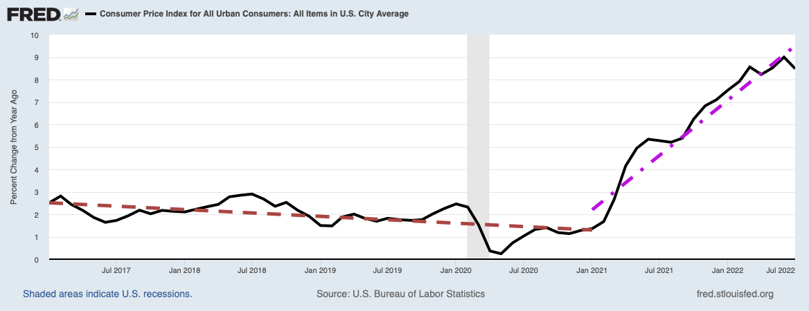
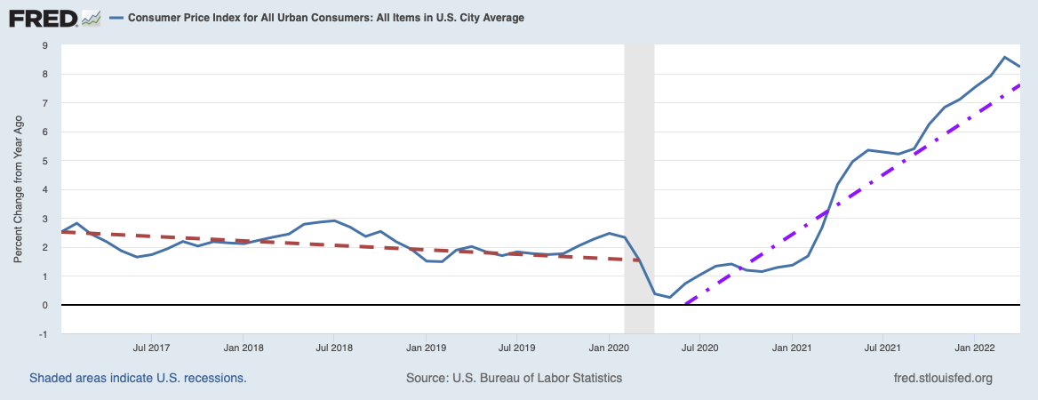
This morning, reading an account of how U.S. GDP increased by only 1.5% in the third quarter of this year, I fell into another unsettling and uncomfortable sense of cognitive dissonance. I do not know about you, but whenever I find myself afflicted with cognitive dissonance, usually I end up learning something I had not thought of before. And so it was in this case.
The marketwatch.com post I was reading, Third-quarter GDP lands with thud: just 1.5% growth, was written by Jeffry Bartash. After delivering the bad news Bartash went on to explain that the economy actually had a great deal of underlying strength.
The slowdown stemmed mostly from the biggest drawndown in inventories in three years. Companies also cut spending on structures such as oil platforms and commercial buildings.
Yet even as businesses showed more caution, consumers continued to spend money at [a] steady clip, a sign they are not as worried. Consumer spending, the single largest determinant of U.S economic growth, rose at a 3.2% annual pace following an even larger gain in the second quarter.
This is where the cognitive dissonance hit me. If “consumers continued to spend money at a steady clip”, then why has the velocity of money been slowing so much, as we showed in Should We Expect Inflation or Delation? and What does Falling Money Velocity Tell Us? If consumer demand is picking up, then so should business investments and the velocity of money. Yet, as illustrated in the blue curve in the chart below, the velocity of money has been dropping fairly steadily since the second quarter of 2006 with only a slight blip upwards at the end of the Great Recession.

The fall of money velocity is not the only cognitive dissonance creating a problem with the statistics. With the GDP growth of the first and third quarters having been the dismal values of 0.6% and 1.5% respectively, what caused the discontinuity of 3.9% growth in the second quarter? This conundrum was chased in the Wall Street Journal post By Another Measure, U.S. Economic Growth Has Nearly Stalled This Year by Eric Morath. That other measure is gross domestic income or GDI. While calculated in different ways, GDP and GDI are supposed to measure the exact same thing: the nation’s total economic output. GDP is calculated by summing up expenditures of consumers, all value added expenditures at each stage of production by companies (to avoid double counting), expenditures by governments, and expenditures by foreigners buying our exports. GDI, on the other hand, is calculated from a sum of incomes generated from production. All net expenditures in the economy should be the incomes of others, so GDP and GDI should be the same. Morath then provides the following chart plotting the growth rates of both GDP and GDI from the third quarter of 2007 to the second quarter of 2015. Although they should lie right on top of each other, they show subtle differences because of the different way in which each is calculated.

Image Credit: Wall Street Journal
As one would expect the two curves generally track each other and usually agree quite well at large percentage changes. Nevertheless, there can be significant differences at times when the rates are small. While the GDP curve with the second quarter GDP as its endpoint shows a sizzling 3.9%, the corresponding GDI point looks to be in the neighborhood of around 0.5%.
Which curve is more accurate? Morath notes that a Federal Reserve economist Jeremy Nalewaik argued in a 2006 Federal Reserve research paper that GDI was a better predictor of recessions. The President’s Council of Economic Advisers in July of this year produced another paper suggesting the average of the two numbers, which they refer to as Gross Domestic Output (GDO), would be a more accurate representation of the truth. If one were to accept this proposition, instead of looking at a 3.9% increase of the GDP in the second quarter, we would be considering a GDO increase of 2.1%. Then the economy would not look so healthy in that quarter after all.
We still have the problem of reconciling recent healthy increases in consumer spending cited by Jeffry Bartash in his MarketWatch post with the general fall of M2 money velocity over an extended time. Checking month by month since June of this year, retail sales actually showed a very mixed performance. By month their percent changes were: June, 0.0%; July, +0.8%; August, 0.0; September, +0.1%. This gives the average change over the last four months of +0.225%! Hardly anything to write home about. Even more worrisome is the trend, which you can immediately pick up by eye from the bar chart below published by tradingeconomics.com.

An envelope hugging the outside of the non-zero bars would clearly be decaying. In light of this data, Jeffry Bartash’s claim of consumer spending at a steady clip is somewhat confusing, but this data at least is consistent with falling M2 velocity. Just as a check, I signed onto the Federal Reserve Economic Data Base and extracted the very same data. The FRED data is slightly worse than that shown on TradingEconomics.com and I plot it below.

This data apparently had not been updated to September yet, but if we add the September data point as +0.1%, the Fed data is: June, -0.1%; July, +0.8%; August, -0.1%; September, +0.1%. The four month average then becomes +0.175%. With both sets of data retail sales hardly look robust, and if anything households are becoming more cautious with their spending. Since they have big debt problems themselves (total debt of households is approximately 80% of GDP; see What is the Economy’s Condition?), their reluctance to part from their dollars is highly reasonable.
Everything has now been explained (or at least been shown to be consistent), with the exception of Bartash’s characterization that “consumers continued to spend money at [a] steady clip, a sign they are not as worried.” Unfortunately, this exercise has left me even more worried than before with the discovery that second quarter’s +3.9% GDP growth reading may not have been accurate, with the GDI growth more consistent with first and third quarter growth,
The larger lesson in all this is that nothing can be taken for granted. Everything you read and hear should be at least doubly checked, and if possible triply and quadruply checked. Even intellectually honest people, as I am sure Jeffry Bartash is, can grab hold of statistics from sources they trust that have some serious flaw in them. Even yours truly is susceptible to such errors, and if you find such an error, please tell the world about it in a comment on the post containing the error. A secondary lesson of this exercise is to always trust your feelings of cognitive dissonance.
Views: 1,886