


Can U.S. Capitalism Be Supported Politically?
A collective life under socialism. (Of course, Bernie Sanders would say this is capitalism!)
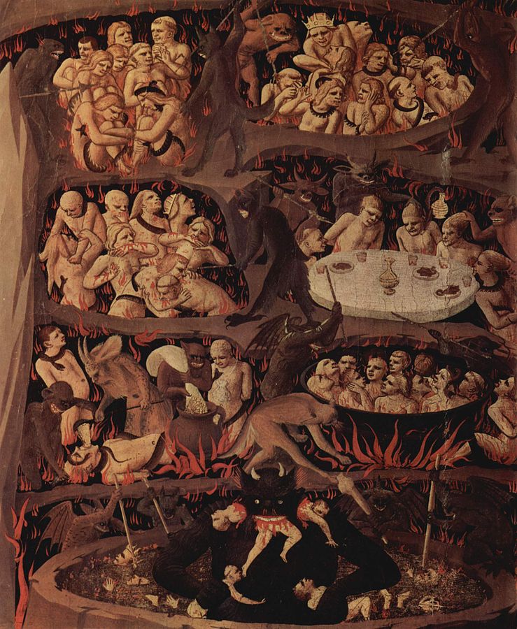
The Last Judgement, Hell By Fra Angelico (circa 1395–1455) – The Yorck Project: 10.000 Meisterwerke der Malerei.
After I wrote Distribution and Use of Wealth in U.S. Capitalism, my friend Chease commented on how politically difficult it would be for capitalism to survive. I have to admit his comments touched on some of my greatest fears. He wrote:
Regardless of the economic efficiency of high inequality, have you considered the political viability? What I see is that people will not accept extremely high inequality. It has been a catalyst of many if not all historical revolutionary movements, from the Magna Carta to the French Revolution, to October 1917. A smart millionaire, it seems to me, would choose to pay more than his fair share in taxes if he thought doing so would keep the country stable enough for him to enjoy his money. … We see in other countries that a low gini coefficient (low inequality) is strongly indicative of a higher average standard of living: happier people, better healthcare, higher life expectancy, few hours worked, etc. By focusing on GDP growth you are essentially saying that future gains are more important than past ones, because you are preventing a large portion of the population from more fully enjoying the gains already made.
Because GDP grows exponentially, unlike those other indicators of well-being, Conservatives can logically make the argument that liberal policies are stealing from our grandchildren. This may be true, but low taxes may in effect be forcing our grandchildren to steal from us, by handing most of the generations savings to millionaires to invest, ostensibly on behalf of the unborn. Furthermore, we may be able to take care of the next generation better if we take care of ourselves, rather than leaving them with maximum amount of money, while wearing our generation to the bone with a highly inequitable economic system.
From what I understand, Chease reflects the beliefs of many young people, particularly those who have gone through a university. If this is the case, then as the Millennials begin to supplant their elders in the electorate as us older folk begin to die off, the U.S. may find itself in a socialist economy before long. The Millennials may be surprised to find that instead of a Bright New Age of Plenty, what they are ushered into will really be a very painful dark age.
One of the unspoken premises in Chease’s comment is that the level of wealth would not appreciably decay if the society moved more in the direction of socialism. It might not grow much, he seems to say, but it will not decline either. His comment does not necessarily imply the country would socialize the means and distribution of production, but at a minimum it foresees higher taxes to fund increased transfer payments to the poor and near-poor. It also assumes that if taxes are increased, government revenues would be increased. Let me begin my response by looking at these two assumptions.
Effects of Greater Government Intervention in the Economy
As I remarked in The Rahn Curve and the Way out of Economic Peril, we actually have data on how economic growth changes as government spending increases as a fraction of GDP. A theoretical model of how GDP growth should look in a plot versus government spending as a share of GDP is called the Rahn curve, and looks like the figure below.

Using data from the Federal Reserve Economic Data (FRED), I obtained the following scatter plot of percent annual growth versus total government expenditures, which includes state and local spending as well as federal expenditures, as a percent of GDP. Each dot represents a quarter beginning with the first quarter of 1947 and ending with the second quarter of 2015. The data is noisy due to GDP fluctuating with recessions and recoveries, but you should be able to see that any straight line fitted through it is negatively sloped. In fact an approximate fit is given by the line equation ΔGDP = 6.0 – 0.6(Sg – 27.5), where ΔGDP is the annual GDP growth rate in percent and Sg is the total government spending as a percent of GDP.

Image Credit: St. Louis Federal Reserve Bank/FRED
Clearly, because the fitted line has a negative slope, we are modeling the U.S. Rahn curve on the descending branch to the right of the government spending that optimizes GDP growth. We have been on this branch for every year since at least 1947. If we wanted to increase GDP growth, we would have to decrease government expenditures. I gave this argument as one reason why we must cut government expenditures in the post Cutting Government Expenditures.
We can get more information on the behavior of government spending by looking at a plot of government total expenditures as a function of time. The red curve in the graph below made from FRED data gives us what we need.

Clearly, government spending has been trending upward for at least 55 years, with government total spending taking up 27% of GDP in 1960 and about 33% in 2015, briefly reaching almost 40% of GDP in 2009. This means that over the decades, we have been descending ever farther down the descending branch of the Rahn curve, moving ever farther from where we need to go!
Another theoretical model intimately connected with the Rahn curve is the Laffer curve, which plots government tax revenues versus the tax rate. Mapping government expenditures to the effective tax rate and GDP growth rate to tax revenue should give a one-to-one mapping from the Rahn curve to the Laffer curve. The mapping is complicated by the fact that the relation between tax revenue and GDP growth is an integral one, which puts the growth maximizing point (the point of maximum slope on the ascending branch of the Laffer curve) to the left of the revenue maximizing point, as shown in the figure below.

Nevertheless, as I discussed in The Rahn Curve, Hauser’s Law, the Laffer Curve and Flat Taxes, we are almost certainly on the descending branch of the Laffer curve to the right of the revenue optimizing point as well. If we decrease both government expenditures as a share of GDP and tax rates, we could expect to increase both GDP growth and government revenues. This would be because the release of resources to the wealth producing private sector would increase the GDP and therefore the taxes on it. If we were to increase both taxes (to fund more transfer payments) and government spending (to make those transfers), we would most certainly decrease growth and government revenues. Making more transfer payments would then increase government deficit spending, increasing future interest payment burdens from the national debt.
I have yet again underestimated the amount of material I needed to cover, so I shall continue this discussion in my next post. There are even more economic catastrophes facing us caused by current government policies.
Views: 1,941
When I look at the Laffer curve, I am skeptical of its usefulness because of the enormous range in estimates of the optimal taxation rate. The most common ranges are somewhere between 30 and over 70 percent. I wonder what the use of such a metric is if its true value is more or less a mystery? The first chart is interesting, though it is a bit overly simplistic to draw conclusions based on it. For one thing, a large part of the effect could be caused by governmental responses to recession which often take the form of large increases… Read more »
Concerning your comment on the scatter plot verifying the existence of the Rahn curve: when you say “a large part of the effect could be caused by governmental responses to recession which often take the form of large increases in expenditures”, you are saying pretty much the same thing I did when I noted “the data is noisy due to GDP fluctuating with recessions and recoveries … “. Keynesian reactions by the government are major causes of the scatter noise around the fundamental trend. Whenever you see a scatter plot of a variable with a single independent variable on the… Read more »
“if the scatter is in a definite band about a trend curve (as is the case here), you know that the functional dependence on the independent variable of the abscissa is the strongest dependence.”
I don’t see how that is a response to what I said. You could have a much less scattered graph and still have 100% of the increase in government be a response to recessions rather than a cause of them. You haven’t shown causation here, and the makers of the graph haven’t even attempted to isolate responsive govt. spending from deleterious govt. interference.
I think we may have been arguing at cross-purposes here. What the Rahn curve scatter plot demonstrates is that GDP growth declines on average with increasing government expenditures as a share of GDP, no matter what the government spends it on! If the government constantly spends 100% of its revenues on Keynesian stimulus, the growth rate would still decline with increasing government expenditures. Of course, stimulus programs have been a small fraction of total government expenditures over time as the economy has been growing over longer periods than it has been in recession. Even so, there is a great deal… Read more »